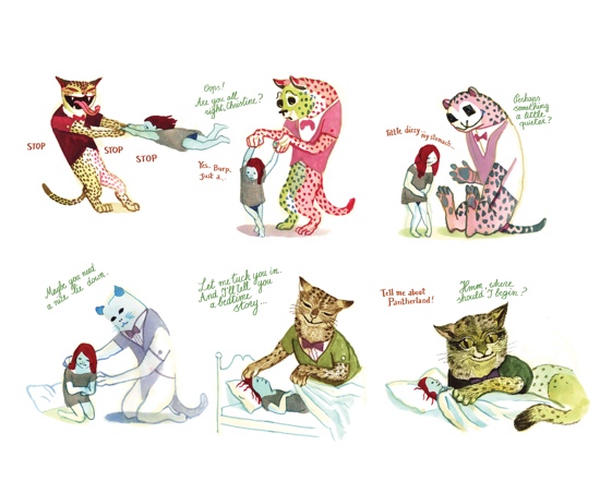
As 2016 draws to an end the inevitable lists appear, so here is a selection of comics that have stood out for me with links to reviews. First is Panther by Brecht Evens (Drawn & Quarterly). This beautiful yet deeply disturbing book depicts the grooming of a young girl by the titular Panther in ways that all too realistically show how the vulnerable can be exploited. Depressingly, this makes it a particularly appropriate choice to highlight at the end of this year, but it is a remarkable book. Becoming/Unbecoming by Una (Myriad) earns a place on my list by being reviewed in 2016, even if it is a 2015 release, as it is one of the most powerful graphic works I have ever read. A look at how society ignores and represses women, and how patriarchal structures embed this in the media and the justice system, it would be nice to say we’ve moved on since the 70s and 80s, but it’s very clear from global events that this is not the case. There are some unhappy convergences with these two books.
A total change of tone is next – Megg & Mogg In Amsterdam by Simon Hanselmann (Fantagraphics) is one of the funniest things I read all year. Hanselmann’s ability to create believable characters intent on wrecking their own lives is a joy to behold. Fourth is Henny Beaumont’s Hole In The Heart (Myriad), a brave and brilliant, life affirming account of parenting a child with Down’s Syndrome. Next up, Mooncop by Tom Gauld (Drawn & Quarterly), a melancholy yet uplifting book about the importance of finding meaning through connections to other people in Gauld’s distinctive, charming style. The long-awaited Patience by Daniel Clowes (Jonathan Cape – UK / Fantagraphics – North America) is a time-travelling masterpiece full of anger, with the fabulous art for which Clowes is renowned. Finally, I loved Antoine Cossé’s Palace No. 0 (Breakdown Press), a hugely inventive collection that showcases both the author’s talent and why Breakdown are one of the most interesting publishers around.
Also on my list are a couple of reissues. First, the boxed set of Neat Stuff by Peter Bagge (Fantagraphics) is a flawless presentation of his early work and an 80s time capsule. Secondly, Linda Barry’s The Greatest of Marlys (Drawn & Quarterly) is just wonderful – she conveys so much truth in just four panels. Last of all, the work isn’t new, but the anthology is – Alan Moore’s Brighter Than You Think, reviewed below, is one of the best books of the year. Pete Redrup
In non-list news, some distribution deals should mean that readers have easier access to two of the the finest and most consistent UK publishers: Avery Hill Publishing will have their books in lots more shops thanks to a deal with Turnaround, and Breakdown Press have secured North American distro with Fantagraphics. Congratulations to all involved. Pete Redrup
Jenny Robins – three favourite comics of 2016
This year has been a great year for indie releases and the breadth of style and content seems to be getting better and better. In March I reviewed I Love This Part by Tillie Walden, whose subtlety and integrity blew me away. Poetic, poignant and beautifully drawn, and heart achingly evocative of first love. Gareth Hopkins’ The Intercorstal 683 which I reviewed still in its pre-pub Kickstarter format in June is now available in an independent comic shop near you and well worth a look. Wordless, narrativeless but packing an intense punch of contemplative compositional abstraction that uses the comic medium to reference the interconnectedness of pure formal aesthetics and cultural symbolism in a deeply personal yet relatable way. Pete said I was also allowed to choose a comic that wasn’t published in 2016, and something that captured my heart this year was Daytripper by Fabio Moon and Gabriel Ba, brought out by DC in 2011 and an Eisner winner in that year. I fell utterly in love with the poetic magical realism and thoroughly recommend you check out this pair’s work if you haven’t already. Jenny Robins
Alan Moore & Marc Sobel – Brighter Than You Think
(Uncivilized)
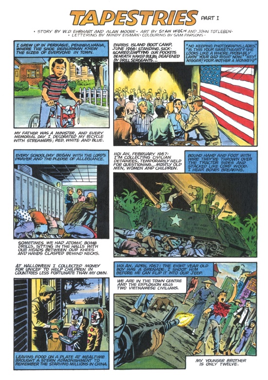
Brighter Than You Think is part of the Critical Cartoons series, featuring the work of a range of cartoonists. It’s a collection of ten Alan Moore short stories, many of which would be extremely hard to track down elsewhere, and the illustrators include Rick Veitch, Peter Bagge, Melinda Debbie and many more. Each story is followed by an essay by Marc Sobel that sets the context and provides fascinating background information as well as providing critical analysis. It’s an approach that works particularly well, as Sobel clearly knows his stuff and illuminates each of the pieces here with his concise but detailed essays.
Love Doesn’t Last Forever is very much like one of Moore’s Future Shocks from when he was published in 2000AD, dark and violent with a twist, and economically told. Written in 1985, the year AIDS entered popular consciousness. Sobel’s essay reveals just how ahead of its time this was, with a bisexual protagonist, a patient zero and more. In Pictopia, meanwhile, is one of his best known short works, a brilliant satire of how the comics industry was changing at the time, with new, darker versions of characters emerging, like Batman transforming into the Dark Knight, a trend he clearly did not like. For me, however, the most remarkable piece is Tapestries, a cleverly structured account of a young soldier’s Vietnam experiences based on three books by William Daniel Ehrhart, showing a much more realistic account of war than was typical in comics of the day. It looks at the war but also the long-term impact on the soldier and the Vietnamese, being based on three books.
What is apparent on reading the comics and the essays here is just how brilliant an author Moore is. There is so much depth and nuance to his work, easily missed without Sobel’s guiding hand. This is an exceptional book, essential for fans but also able to serve as a brilliant introduction. Pete Redrup
Stathis Tsemberlidis – Picnoleptic Inertia
(Breakdown Press)
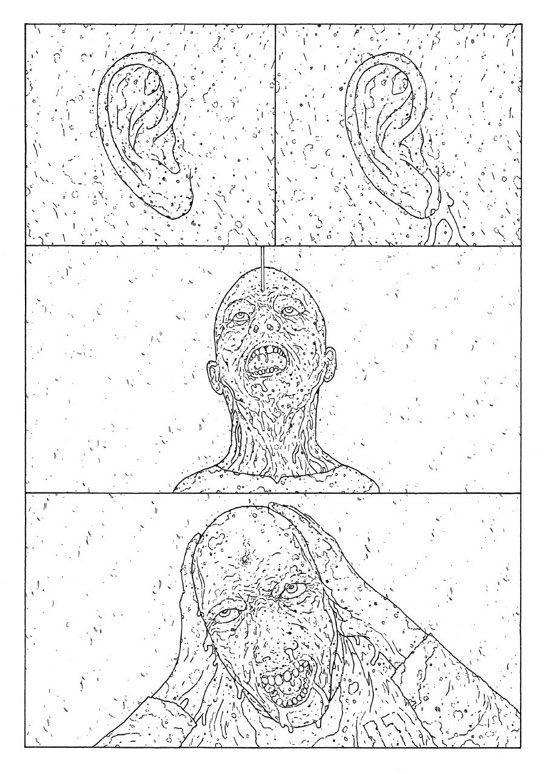
Stathis Tsemberlidis is one half of Decadence Comics, along with Lando. Breakdown Press collected several Lando pieces in Gardens of Glass in 2014, and it has done the same for Tsemberlidis with Picnoleptic Inertia. It’s hard to write about one without the other, as their work is so complimentary, and so different from pretty much everyone else. They depict similar worlds with different themes, and draw with a similar line.
The work here is characterised by a clean line but a noisy page. Everything – the ground, sky, buildings, clothes and people – are covered in specs of detritus. There is an overwhelming presentation of transformation and decay. Seemingly set in the near future, these stories do present invasion, violence and conflict, but not overwhelmingly so. Indeed, compared to Lando there is more fucking and less fighting. Instead we see life cycles taking place, the present decaying and the future emerging transformed, often via some sort of penetration.
Although the wordless style here suggests a certain detachment, there is nonetheless clear social commentary. Many symbols are evident, often religious, and often repurposed. Certain images frequently occur – lizards, the third eye and geometric shapes. Characters are often in a pose of meditation, supplication or prayer.
This book presents a thrilling, unique and consistent sci-fi vision, austere and often terrifying. Individual human life is presented as insignificant in the face of entropy and transformation. This book is a great chance to pick up work that would be very hard to track down in the original releases, and is highly recommended. Pete Redrup
Anna Haifisch – The Artist
(Breakdown Press)
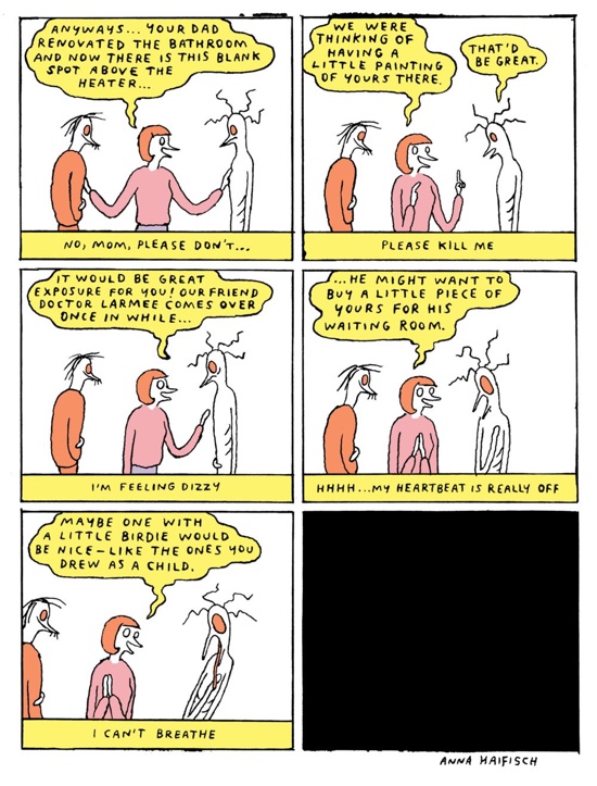
The Artist by Anna Haifisch collects a run of her Vice strip of the same name into a slim hardback volume. An anthropomorphic wingless bird, the Artist lives in a world populated by other creatures, mostly birds and cats, many of whom are also struggling to succeed in creative industries. Most of the action takes place in slightly run down urban settings, but from time to time strips are set in strange deserted landscapes with mountainous backdrops.
Haifisch’s work is very funny. There’s an obvious appeal for an audience involved in creative work – this is a frequent subject, especially the difficulty of getting exhibited and being successful. One chapter has a parody of a modern design studio, complete with ball pool, fishing simulator and popcorn machine. However, much of it simply relates to the human condition, with the disparity between what is said and what is thought providing much of the humour. The Artist is socially awkward, and confidence usually turns to disappointment within a few panels.
The artwork has a charming, scratchy line and a faintly unsettling colour palette. Characters have blank yet strangely expressive eyes, and the overall effect is a melancholy charm. There’s a preoccupation with what value art has for society, and how it can be measured. The final strip exhorts us to look on artists’ work with nothing but love and mercy. In this case, there’s no need for the mercy, the love comes naturally. Pete Redrup
Anders Nilsen – A Walk In Eden
(Drawn & Quarterly)
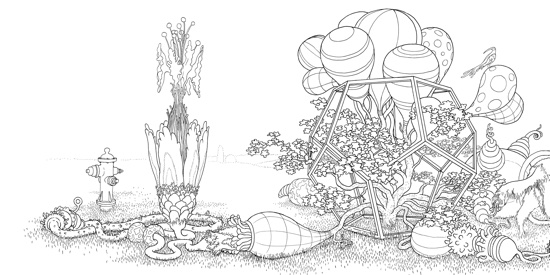
A few months back, when I requested a review copy of the new Anders Nilsen title, A Walk In Eden, I did not realise that it was a colouring book. This might seem baffling at first, but of course this makes perfect sense for Anders Nilsen. Anyone who has read his recent Poetry Is Useless sketchbook will recall his bizarre evolved root pictures that must have been as much fun to draw as to look at. It is this Nilsen, rather than the arch aphorist, who we get here, having had free rein to produce a generously sized example of the form.
Consider me sceptical of adult colouring books (not that that’s how this is described; as the back cover notes it will also work for kids) but this is one of those times when someone’s ability to do something greatly outstrips my capacity for thinking of reasons why I won’t like it. In short, I got sucked in as soon as I opened it. The pages are filled with landscapes populated by strange creatures, from prehistoric beings to oversized animals from the present – ducks stand next to dinosaurs while a payphone dangles ignored and strange geometric structures can be seen. There is evidence of modern technology but it appears to have been overrun by nature. There are a couple of pullout pages, with extra wide strips, and we see that humans aren’t excluded from his idyllic world, although they certainly aren’t the apex predator here. A strange sort of equilibrium persists, and it looks fine to me.
Some pages feature great close-ups of his creations, and there’s just so much depth and detail in all the images. Indeed, some of these pages are so dense that you could easily colour away as you attain a trance-like meditative state. Consider me converted. Pete Redrup
Neil Gaiman, Fábio Moon & Gabriel Bá – How To Talk To Girls At Parties
(Dark Horse)
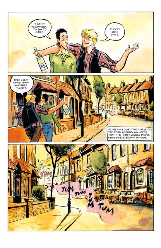
How To Talk To Girls At Parties is a Neil Gaiman short story adapted by Fábio Moon and Gabriel Bá, about two adolescent boys looking for a party to which they have been invited. Vic is the driving force here, confident and assured, while hesitant Enn hopes they won’t find it after all. Enn is the narrator, and we learn that while Vic has had plenty of girlfriends, Enn is utterly baffled by the opposite sex. Vic’s advice is to just talk to them – “They’re just girls. They don’t come from another planet”.
At the party Vic quickly pairs off with the girl who opened the front door. At this point there only appear to be girls at the party, and as shy Enn talks to the first one he has the courage to sit next to, it becomes apparent to the reader if not the protagonist that all is not normal. These girls do indeed come from another planet. Enn is a convincing portrayal of a shy, adolescent boy, hopelessly out of his depth. However, this is not a story that takes such care with the female characters. I suppose an argument can be made that a book from the perspective of a fifteen-year-old boy will necessarily present a limited view of girls, but if Gaiman want to appeal to a wider range of readers, I think he needs to do better. With lines like “…whatever it is that makes a beauty something more than a shop window dummy” (emphasis mine) and “…but she, of course, was Vic’s…” it’s hard to see beyond the objectification of women.
The artwork is stunning – a variety of panel layouts are used to show off the characters, the setting and the striking watercolours. Where it excels is in the depiction of the more poetic writing while Enn talks to Triolet, the third girl. I loved the art but struggled to like the story. With some characters not easy to warm to and others feeling underwritten, it is hard to care about them.
It’s perhaps not the place of a review to discuss the ending for fear of spoiling the story, but I found it problematic. After the boys leave the party, Vic is very upset. It’s not clear if this is because of something he did, or something that was done to him, but my interpretation was the former. The ambiguity is clearly intentional, and nothing about Vic is particularly sympathetic, but this jarred somewhat with the overall tone the book establishes. All the flaws lie with Gaiman’s story, and all the strengths are Moon and Bá’s. It’s beautifully drawn and coloured, but although cleverly written in places, I found it to be representationally problematic. Pete Redrup
M.R. James, Leah Moore & John Reppion – Ghost Stories Of An Antiquary, Volume I
(SelfMadeHero)
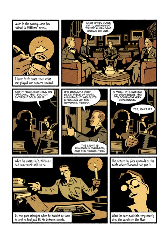
There are many kinds of horror comic. If you want pure terror and sleepless nights, then Emily Carroll and Josh Simmons cannot be bettered. However, if you fancy something a little more classical, then the work of M.R. James is a very good place to start. This slim book contains four of his stories, adapted by Leah Moore and John Reppion, each one drawn by a different artist. These are extremely well written ghost and horror stories, as one would expect from their pedigree, and whilst they have a certain nostalgic quality, they still manage to chill the reader.
The stylistic variations in the art results in each story having quite different impacts. The first, Canon Alberic’s Scrap-book, is an effective story but the facial expressions are somewhat exaggerated for my tastes and the colour palette is a little bright. The impact of these is such that when the horror comes the contrast between that and the rest of the story is slightly jarring. Next is Lost Hearts, drawn by Kit Buss, who gives the characters huge, often cute eyes, reminiscent of some manga, which in no way keeps the horror at bay. This story unfolds particularly well. Third is The Mezzotint, illustrated by Fouad Mezher, which reminded me a little of some of Seth’s work visually. It’s a genuinely chilling story with art that is perfectly suited to the subject, particularly in regard to the palette. Finally, The Ash-tree (drawn by Alasdair Wood) is a tale of witchfinding and a stately home with some very creepy imagery.
There’s a lot of pleasure to be had from old fashioned ghost stories of this sort. This is a very well executed collection, well written and drawn, and I look forward to seeing the next volume. Pete Redrup
Rob Davis – The Can Opener’s Daughter
(SelfMadeHero)
In the Eisner-nominated The Motherless Oven writer/artist Rob Davis introduced us to a world where children build their parents, knives rain from the sky, and everyone awaits a preordained deathday. Unfortunately for the teenaged Scarper Lee, there is no time to make sense of his own fast-approaching death because his father, a vehicle of Seussian strangeness, has gone missing. To help Scarper with his search is new-girl Vera Pike and misunderstood Castro Smith, but can they rescue both Scarper and his dad before time runs out?
The Can Opener’s Daughter begins as a prequel introducing further oddities by exploring the childhood of Vera Pike. Without revealing too much we discover that the mysteries of Vera’s omni-potent mother, and her non-existent deathday are both true. Once Vera’s past catches up with the present the book continues from where The Motherless Oven left off, but many questions still go unanswered since a final book in the trilogy is forthcoming.
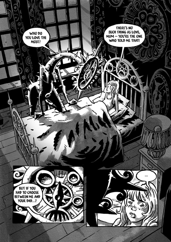
The best aspect of the series is Rob Davis’ art. His world building is filled with off-the-wall designs, but he sprinkles every object with visual symbolism that helps ground the reader in a believable reality. For instance, Vera’s mother, the dictatorial and insecure prime minister, looks like an inside-out iron maiden. Spikes protrude off every limb clearly illustrating her inability to nurture her daughter. Every interaction between mother and child reflects both the physical and mental torture of the situation, and like Vera I often found myself squirming in my seat whenever her mother came near. On the surface Davis seems to be building as absurd a world as he can possibly concoct, but the details reveal that nothing is random.
My one complaint of this prequel/sequel is that the first book felt self-contained. I never expected a sequel, and this book in some ways softens the tragedy of book one by continuing events that I felt were left poetically ambiguous. I oddly prefer unsolved mysteries because then my imagination keeps the world building. I feel like a magician just revealed his trick, and now the magic is missing. Of course this is Davis’ world, and he therefore has the freedom to expand it as he wishes regardless of my expectations, but I for one am not sure that this continuation was necessary. Matthew Laiosa
Pushwagner – Soft City
(New York Review Comics)
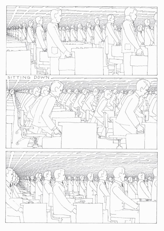
Drawn over a period of six years in the 1970s but not commercially released until 2008, Soft City by Norwegian artist Hariton Pushwagner depicts a world of pill-popping drones unanimously synchronized like marching ants on their way to and from work. Skyscrapers blot out the sky, endless rows of cars enter hive-like parking garages, men work in stadium-sized offices, and women with their leashed babies travel through shopping malls as if on factory conveyor belts – horror of horrors.
In the intro by Chris Ware, who also designed the book, he says that Soft City should not even be classified as a graphic novel since it was created before the term had any kind of meaning or relevance, plus the book lacks any typical novelistic structure. A couple more apt descriptions might be ‘four-dimensional readable image’ or graphic poem. Perhaps the best design for the book would have been an accordion fold that could be stretched around a room or lengthy hallway like a paper tapestry. Regardless of the book’s definition, it is a work of art that forty years after its creation is probably still too avant-garde for the general audience.
It is ironic that such a scathing look at mass consumerism takes the form of a comic book, a medium now reflected primarily by its cash-grabbing summer blockbusters. Perhaps this is one of the soft futures Pushwagner is warning us against? One warning in the book already turning into a reality is the bizarre dialogue that reads like eccentric newspaper headlines, “Streamline first class business taste of life.” In our world of abbreviated text messaging and clickbait, is it so hard to imagine a near future where people speak only in tweets?
In what many consider the greatest work of speculative fiction, Nineteen Eighty-Four, the hapless Winston discovers that there is no escaping Big Brother, and in the end he patriotically rejoins the masses. The most terrifying aspect of Soft City is that no one even attempts escape. Soft citizens enter dizzying perspectives of infinite repetition without query or concern. There are no heroes, arena battles, daring rescues, or climactic revolutions because there are no individuals. In this world, characters have lost the ability to identify the faults in the system because they have become the system.
Soft City throws you into its world without a timeline, so we can never know how this world came to exist, but we can assume that it didn’t appear with a single swipe of the hand, in fact, it probably didn’t require any use of force at all. Matthew Laiosa

