Irony. Condition. Gervais. Words associated with postmodernism today are rarely appealing, but it wasn’t always like this. Roxy Music, Angela Carter, A Clockwork Orange. Factory records, Leigh Bowery, The Big Lebowski. ‘High’ and ‘low’ culture mixed. Quotation and pastiche. Works announcing their own artifice to cannily uncanny effect. When people talk about postmodernism they tend to talk around it; no one can tell you straight what the word is supposed to mean. It was a chimerical phenomenon, a set of moves away from movements, the ism at the end of the isms. But it’s a term I sometimes find myself using as shorthand for a certain playful sophistication, a confidence and liberty arising from popular cultural wealth toward the end of the 20th century.
The V&A’s enormous exhibition Postmodernism: Style and Subversion 1970-1990 joins the dots between skyscrapers and pop stars, Koyaanisqatsi and teapots. It’s a sensational show, dramatically lit and stuffed with amazing artefacts: they’ve rebuilt buildings, flown in the costumes from Blade Runner, constructed a shrine to Grace Jones. Pop features heavily, in videos, costumes, sleeve art and magazine design: no glam rock, for some reason, but plenty of post-punk and synthpop. It’s spectacular as museum shows go, and the curators talk a good game; but you may emerge, as I did, thinking that postmodernism was really a mirage.
Surrealism without the unconscious

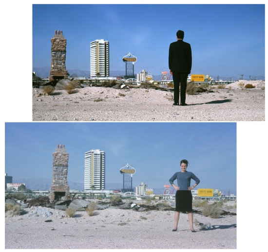
Albeit a mirage that may have taken solid form in the Nevada desert. Architects Robert Venturi and Denise Scott Brown saw in Las Vegas an exit route from modernism’s “correct" way of doing things. (Their film footage of the Strip, taken from the window of their car in the mid-60s, is a treat.) And architecture is the field in which postmodernism has its clearest meaning. The story goes that modernist architects had become puritanical, plonking uniform, minimalist International Style buildings down across the world with scant regard for their surroundings. Postmodernists would mix up earlier styles with modernist and pop elements, replacing unity with eclecticism to provide pleasure in the built environment. Venturi and Brown are set up as architectural postmodernism’s bratty stars, answering van der Rohe’s “less is more" with “less is a bore". But they actually describe themselves as modernists who aimed to humanise the space that modernism opened up, something you can just about see in the house he built for his mum (a pimped-out dream bungalow, monumental but discreet) or their cheerful extension to London’s National Gallery, where the irregular rhythm of the columns keeps it sympathetic with the surrounding buildings. Not so brash after all.
Some amusingly angry architects do feature, though: Nils Ole Lund’s apocalyptic 1976 collage depicting a dilapidated Leicester University Engineering Building surrounded by waste looks a little sorry today (while the building still stands strong). Their cheering as modernist social housing blocks were demolished is even harder to join in with after 30 years of seeing them replaced with expensive, cramped private blocks for the middle class to buy using dubious mortgages – machines for making other people’s living in. But creative postmodern social housing was built: Ricardo Bofill’s neo-classical fantasia Les Espaces d’Abraxas, his “Versailles for the people", became the star of Terry Gilliam’s Brazil. Fredric Jameson’s memorable description of the bombardment of depthless, disconnected imagery in 80s video art – “surrealism without the unconscious" – applies as well here. Still more so to Hans Hollein’s set of columns, spanning styles from ancient to modern; a Giorgio de Chirico scene without the deep space.

Hans Hollein, façade from Strada Novissima, The Presence of the Past, 1980. Biennale of Architecture, Venice
In Every Dream Home a Heartache

Alessandro Mendini, destruction of Lassù chair, 1974 © Atelier Mendini. Image courtesy CSAC-UNIVERSITA’ DI PARMA
The exhibition opens with footage showing Alessandro Mendini‘s attempt to do with household furniture what Alejandro Jodorowsky did with film. The chair’s pyramid/ziggurat structure (a motif in the show that appears everywhere from the Tyrell Building in Blade Runner to Devo’s hats) recalls ancient cultures, suggests climbing up to a heightened state; but it’s also a modification of modern design. If I were to talk it up still further on his behalf I’d say it posed a challenge to modernist rationality, a new way to incorporate the primitive and irrational into the modern world. But that aim already has a name: Surrealism (and besides, the chair is useless). This a recurring point in the exhibition: almost every intriguing technique or strong design is essentially modernist, and a recognisable postmodernism doesn’t appear from the assembled parts. It’s not clear how the bricolage of Charles Jencks’ ‘Adhocist’ design (a chair created from leftovers such as pram wheels) and Bernhard Schobinger’s junk jewellery is postmodern while the bricolage of Dada or Arte Povera, for example, is modern. Whereas when Etore Sottsass left behind the exuberant modernism that made his name (like the Olivetti Valentine typewriter) and went ‘postmodern’ with the <a href="http://en.wikipedia.org/wiki/Memphis_Group“ target="_out">Memphis Design group, the results weren’t so great. They do explain the pastel shades and grey dappling that crawled over mid-80s packaging like plastic lichen, though.
Film and fashion designers did thrive on mashing up styles to create unique worlds and characters, however. Vivienne Westwood and Rei Kawakubo assembled costumes that were dramas in themselves, from what appeared to be found bits and pieces. While Charles Knode and Michael Kaplan’s costumes for the replicants Zhora and Rachael in Blade Runner update fetish and film noir-era fashions to resemble elegant armour made from artificial materials: nearly human, but nearly indestructible. And with admirable pretension, Cinzia Ruggeri made this knockout piece, a dress inspired by an anthropologist:

Cinzia Ruggeri, Homage to Lévi-Strauss dress, Autumn/Winter collection 1983–4 (c)V&A Images
Slave to the Rhythm
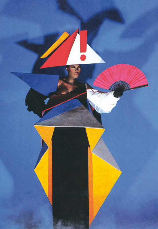
Pop video might have been the ideal medium in which postmodernism could realise itself. Its ease with non-narrative performance was way ahead of non-commercial arts; what better way to bombard people with sensational imagery, free of the need to provide meaning or realism? Or to reinforce the status of the semi-fictional, living creation that is Grace Jones through self-reference? The amoral inclusivity of the imagery in ‘Slave to the Rhythm’ reflects the club, pop art and fashion cultures she came up through in New York. It plays with stereotypes only to create striking images; profane beauty is an end in itself, and Trevor Horn’s music is overloaded with the stuff. The curators didn’t include this video, but do present the famous, impossibly enhanced photomontages of Grace Jones (familiar from the Island Life cover) in a grand triptych, and the maternity dress that long-term collaborator Jean Paul Goude created for her. They could all carry the ‘postmodern’ tag pretty convincingly: the dress was inspired by Soviet Constructivism, but rather than a new kind of society Goude and Jones wanted to construct a fabulous confection for you to behold and submit to.

Jean-Paul Goude and Antonio Lopez, Maternity dress for Grace Jones, 1979 © Jean-Paul Goude
And submission is a theme running through other performance pieces here, as you might expect in the era when the rise of the right became starkly apparent. Devo’s <a href="http://www.youtube.com/watch?v=Xbt30UnzRWw”target=_out”>‘Whip It’, a big MTV hit in its early days, saw them looking boldly stupid in costumes that echoed 50s sci-fi, in the midst of a gently pervy pastiche of old Westerns. De-evolution, the reversal of modern progress, is their manifesto, and (as the wall text won’t inform you) the song was inspired by Thomas Pynchon’s song parodies in his S&M-heavy, apparently postmodern masterpiece Gravity’s Rainbow.
Which naturally brings us on to ballet. As well as audaciously referential, decorative costumes for NY ‘punk ballerina’ Karole Armitage courtesy of Jeff Koons and <a href="http://www.davidsallestudio.net" target=_out">David Salle, you’re treated to startling outfits for Leigh Bowery and Michael Clark and Company. Wrestling masks, basques and capes inspired by 17th century furniture embroidery, combined with sequinned stockings and codpieces: a great look. Here they are in action, dancing to ‘Venus in Furs’ (warning: contains mimed cunnilingus and a pantomime horse):
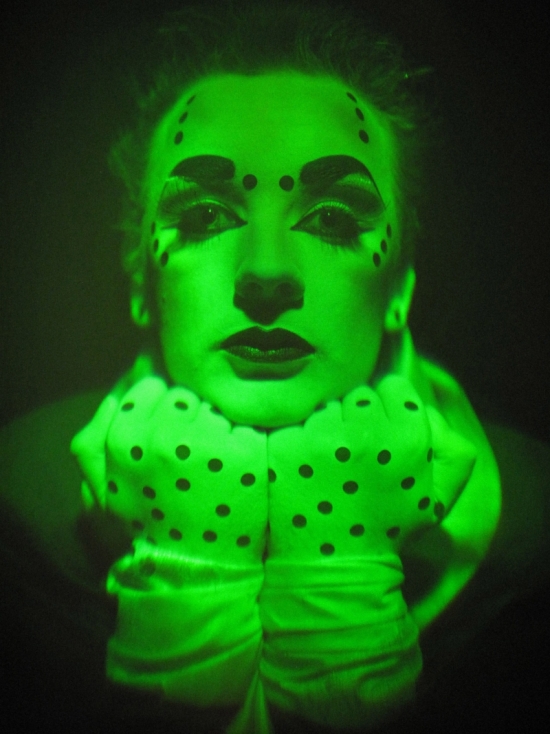
But where these performances might have seemed slyly subversive to an informed audience, it’s the guy who catches your eye as you leave the room who had a more tangible impact. Very few people in the UK had MTV, but we all had TOTP. And thanks to family favourite, ‘Do You Really Want To Hurt Me?’ hitmaker Boy George and his peers, many of my earliest childhood memories are of watching men transformed into something more through a mixture of make-up, often dress-based costumes and smart, magpie music.

Richmond Holographic Studios – Edwina Orr & David Trayner, Boy George hologram, 1985. Silver halide on glass © Jonathan Ross Hologram Collection London
Dancing about architecture
One of the final rooms presents an eclectic mix of record sleeves, magazine design and art from the period. The layouts and fonts of the 80s style mags like Terry Jones’ i-D were a confident mash-up of styles that suited their content: class politics, fashion, music and art were all treated with the same seriousness (this was a long way off Nathan Barley.) The collection of record sleeves is a pleasure, but does suggest that museum culture and pop culture have never mixed as easily as that near-oxymoron, the utopian postmodernist, might like to imagine.
Kraftwerk’s The Man Machine is presented as an example of postmodern quotation because, er, its front cover was inspired by Constructivism, while the back cover quotes this page from El Lizzitsky’s Suprematist children’s book From Two Quadrants. But it might be the most purely modernist artefact in pop history: not only because they were inspired by modernists from other media (the idea of the man-machine recalls famous Futurist and Vorticist sculptures) but because of the groundbreaking music itself. Kraftwerk used the latest technology in ways it hadn’t been widely used before: the sound is entirely synthetic, the electronic processing on the voices creates a man-machine synthesis. Form follows function absolutely, as it always did with Kraftwerk: they celebrated the infrastructure of modernity – motorways, train journeys, bike races – by rendering your experience of it in a new medium, without inflection or flourish. The elegant repetition of their songs stretches forth in a sublime unity reminiscent of an International Style edifice, as they might say in Pseuds Corner.
And of course, they pretty much invented synthpop and techno: new, economic styles that most people who go on about these things would end up describing as modernist. Which raises another point: somewhere in the middle of the period this exibition covers, pop music hit its own modernist phase. So many new forms were born – disco, funk, punk, post-punk, synthpop, hip hop, house – that parallels with early 20th century modernism, with its Futurists, Suprematists, Dadaists and so on, were bound to be made by its more selfconscious practitioners. That they were mixed up with what you might call pop’s postmodern strains (glam rock, particularly Roxy Music – the key missing piece in this exhibition – and early-80s New Pop) raises yet another: in most art forms these tendencies don’t develop chronologically. Periods of innovation and playfulness, production and enjoying he spoils, overlap in messy ways that can be inconvenient for someone trying to formulate a PhD thesis.
Grandmaster Flash’s turntables are here, with Wild Style showing behind them. You can see why: ‘The Adventures of Grandmaster Flash on the Wheels of Steel’ is a great example of the consumer manipulating existing creations for fun and profit, and becoming a creator himself.
But if hip hop began in a ‘postmodern’ state, it soon found its own minimal, modernist form:
Which is the basis of what became the most popular music in the world, with all kinds of divergent takes on itself.
One thing we can all agree on is the quality of Peter Saville’s sleeve designs. He was the right age to have learned as much from pop as he did from academia (he’s said of Roxy Music, “they were my art college”) and young enough to make connections between new (to him) discoveries from past design – like The New Typography – and new developments in pop. The sleeve of New Order’s Movement modifies a poster design by the Italian Futurist Fortuno Depero, motion being a central concern of their, er, movement (you can compare the two here). After Joy Division’s monochrome modernism, New Order’s sound became steadily more sanguine, and so did their cover art. This piece for Power, Corruption & Lies contrasts a detail from Henri Fantin-Latour’s darkly seductive still-life A Basket of Roses with Saville’s own hard colour-code in the top corner; just right for the combination of romance and digital rigidity you hear on the record. It was seeing design as compelling, enigmatic and good as that at an early age that made me realise there was treasure hidden away in books and museums. Is that postmodernism? I dunno.

Power, Corruption, and Lies New Order album cover © Peter Saville
Postmodernism: Style and Subversion 1970-1990 runs at the V&A, London, until 15 January 2012


