It’s been a while since the last tQ dispatch from the world of comics, and much has happened. Last time I reported on some accusations of predatory behaviour within the industry and that story developed considerably. For those with interest and ample free time, a biting series of articles by Abbhay Khosla provide all the wretched detail one could ever need. Let’s hope change is on the way.
Outgoing comics laureate Hannah Berry released the findings from her survey of comics creators, which provide insight into the precarious nature of employment in the industry in the UK and much more. Meanwhile, the appointment of her successor has been somewhat controversial, the role going to a retailer rather than a creator for the first time, to the disapproval of many.
Finally, it would be remiss of me not to note with great pleasure that Biscuits (assorted) by Jenny Robins, frequent reviewer in this column and winner of the Myriad First Graphic Novel Competition 2018, is now available for preorder from the publisher, and to combine that with a reminder that if you plan to buy anything reviewed here, buying from the creator or the publisher direct is a great way of increasing the chances that you will continue to be able to find such great independent comics available, particularly in these difficult times. These people are not making much money from this, and it would be a shame if Jeff Bezos was the only one to profit.
Danny Noble – Shame Pudding
(Street Noise)
It’s been a few years since we’ve covered any Danny Noble comics here at tQ. This is neither due to laziness on her part nor negligence on ours – she’s been quite busy with illustration work, notably Adrian Edmondson’s two children’s books. Now she’s back to comics with her first full-length graphic work, the autobiographical Shame Pudding. The visual style will be familiar to anyone who has read her previous work, misshapen wispy-haired heads full of life and mischief, as we are introduced to her very close multi-generational family. Every gathering includes grandparents, parents and children. Early chapters bring us the sort of things many people will have memories of – bickering siblings, waking up much too early on Christmas morning and then being too tired to enjoy the day, and the loss of a grandparent.
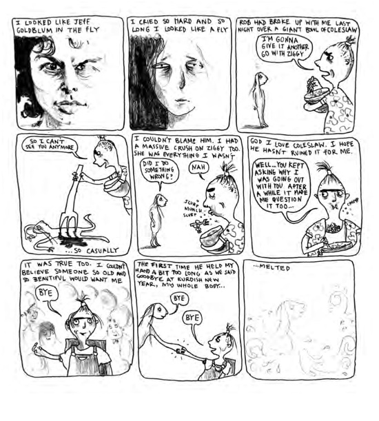
Why are we interested in someone’s autobiography? It takes real skill to identify the moments that are important in our development, and to present them in a way that everyone can both relate to and be entertained by. Noble has this absolutely nailed, from the family times as a young child to the moments of loneliness and insecurity that so many feel in their teenage years, to finding yourself as an adult. It doesn’t hurt that she is, as noted before, incredibly funny. The faces she draws, the physical forms her characters take, fluid and bulging with life, are irresistibly hilarious. We see her transform into an awkward teen, share the pleasure of finding her own music that is not what her friends or parents listen to, and see her navigate the challenges of being shy inside and loud outside. Her first significant breakup is delivered as her boyfriend eats, giving us the line “God I love coleslaw. I hope he hasn’t ruined it for me”. She becomes a musician, with a great chapter on touring with no money, and then heads to art school.
Noble doesn’t seek to present herself well, but as human, and in doing so, is very easy to relate to. Plagued with the sort of self-doubt that all reasonable people feel at times in their life, she just comes across as very honest here. As she deals with elderly relatives experiencing a stroke and then dementia, the inevitable bereavement and all the feelings that follow, her ability to write and draw about this in a sincere way is impressive. She is quite brilliant on grief, and familial love, and a book that is about her is very much also about her family, and what it means to be a family member. This is a very fine read indeed, and you can and should buy a copy from her website. Pete Redrup
Matthew Dooley – Flake
(Jonathan Cape)
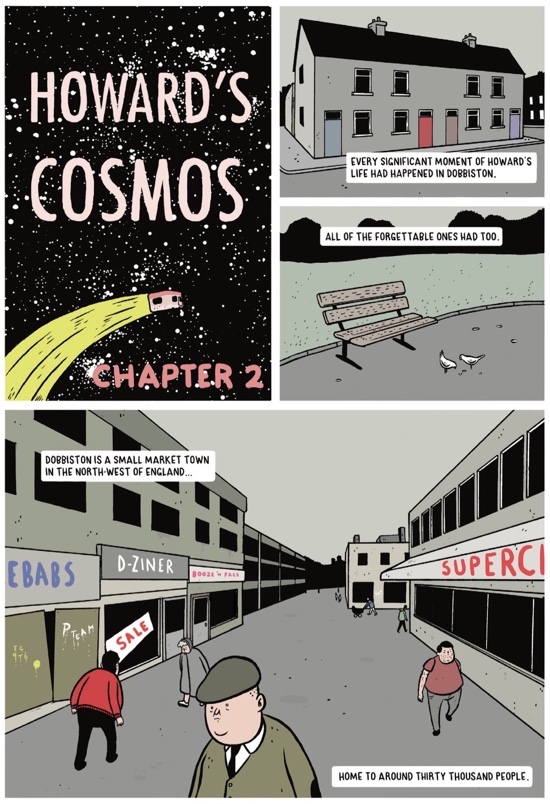
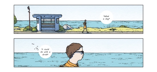
Matthew Dooley has clearly been busy since we last featured his comics. Flake is his first full length book, and has the distinction of also being the first graphic work to be awarded the Bollinger Everyman Wodehouse Prize. Set in the fictional seaside town of Dobbiston in the North West of England, the story concerns Howard who sells ice cream from a van. This is the family trade, and he works the same patch his father did, but finds his business under threat from a rival organisation run by his half-brother Tony.
Ice cream wars may be the subject, but this is not a violent retelling of the Glasgow rivalries that left six dead. Instead, Dooley’s considerable talents are once again directed at making us laugh. Flake is immediately and extremely funny, full of dry witticisms and pleasing digressions right from the start. A page showing local ice cream vans that were vanquished by Tony’s empire include such brilliant names as ‘Walt Whipman’ and ‘Good Golly Miss Lolly’. Another shows the cultural delights of Dobbiston, including the newsagent, the magistrates and the snooker hall, most of which appear to come from the 70s rectangle school of architecture.
Flake is exquisitely drawn in a flat, sharp style. Buildings are all neat right angles while the characters are drawn full of curves, with big heads and tiny eyes. The book follows a classical narrative arc of the sort that, when done this well, rarely fails to raise a smile. The cast of eccentrics and their heroic failures and occasional successes charm, and Dooley gives us a quiet ‘never give up’ message, as despair leads to extreme actions but paves the way for eventual success. This is well worth your time and money – I enjoyed it immensely. Pete Redrup
Adrian Tomine – The Loneliness Of The Long-Distance Cartoonist
(Faber & Faber – UK / Drawn & Quarterly – North America)
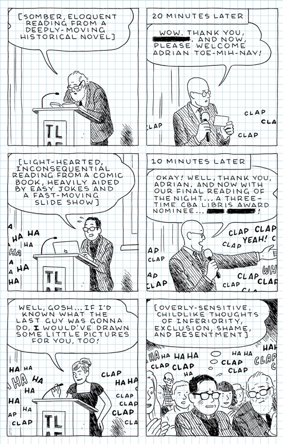
Adrian Tomine’s The Loneliness Of The Long-Distance Cartoonist is a book that exists, in part, to make quite clear that the lot of a cartoonist is ignominy and disappointment. He begins in 1982 with humiliation at a new school as he reveals the scale of his obsession with comics to his new classmates. This does not go well. From here he jumps forward 13 years to San Diego Comic Con, by which time he is starting to be well known. His expectation is that, here at last, things will be better than school. No physical harm befalls him but being among "his people" turns out not to be what he dreamed of as he is accused of being a Daniel Clowes impersonator, and the next year is arguably worse when Frank Miller is reading out Eisner nominations and flatly refuses to even attempt to say the name Tomine. Every new chapter ends the same way, mortifying awkwardness and embarrassment the outcome of any and every given situation. The sheer scale of this is genuinely impressive, and makes me feel considerably better about the comparatively modest humiliations I’ve experienced.
Tomine covers a long stretch of life, from 1982 to 2018, and another motif emerges, that of how we connect to other people. As he moves from being young and single, and delighted to meet cartoonists he’s looked up to for years, to meeting his wife and becoming a parent, we can see a change in how he relates to others and what his priorities are. His technique of always drawing his glasses with blank lenses fully masking the eyes behind leaves us free to project our own empathetic feelings upon him. There’s a running gag about how to pronounce his name and various manglings by people less cowardly than Frank Miller. The self-deprecating tradition of successful cartoonists writing autobio is very much in evidence here. Whatever you think of Tomine, he’s undeniably great with a punchline, and this is more apparent now that he is writing about his own life rather than one of his fictional characters.
Frankly, it seems it would be cruel of his publisher to send him on a book tour for this, but perhaps COVID-related virtualisation will at least mean he can do a reading then click ‘leave’ rather than make excruciating small talk or sit alone in a nearby restaurant. The Loneliness Of The Long-Distance Cartoonist is a nicely presented clothbound hardback made to look like a squared Moleskine notebook, complete with bookmark and elastic closing band – I definitely wouldn’t wait for the paperback here if you can spring for this edition. Either way, it’s another very good book from Tomine. Pete Redrup
Simon Hanselmann – Seeds & Stems
(Fantagraphics)
Simon Hanselmann has been releasing ultra-limited Megg and Mogg zines online for many years. I’ve grabbed a few of these, but as always the cost of shipping from the USA adds inevitable expense and, as noted previously, if the panel count is high, decrepit eyes like mine are absolutely not up to the job, leaving me eyeing up the purchase of a magnifying glass. But now, Seeds And Stems comes to the rescue, collecting stories from the zines and elsewhere in a gratifyingly larger format. Hanselmann has thought of everything – it has been designed for toilet-based reading, requesting storage adjacent to the lavatory and noting that “a plastic piss-guard is included” in lieu of a dust jacket. Should you be a devoted collector, upset that anyone can now buy copies of what you might have spent hundreds of dollars accruing, the first strip skewers you brutally, with “All of your collecting was for nothing. Fuck you” as a punchline. It’s wise to get this dealt with up front – if you are the sort of person to take offence, there’s a fair chance something in here is going to do it, so why not get that clear from the outset?
Within the already strange world of Megg and Mogg, the strips here go further and weirder than the other titles. The lack of a through narrative works well, with many of these representing dives into Hanselmann’s imagination. There are non-canonical deaths of major characters, and brilliant diversions, such as Twilight Zone where everything turns Australian, and War Of The Worlds / DIY, drawn in a style reminiscent of Lando and Stathis Tsemberlidis’ Decadence Comics. Day 10,632 full of ennui, crumbling mental health, self-loathing, disgust and betrayal, is a perfect distillation of this series. Representing excellent value, with 350+ pages for the price of getting a couple of zines shipped over here, it’s an essential release for anyone who has enjoyed Hanselmann’s work before. Pete Redrup
Sophie Yanow – The Contradictions
(Drawn & Quarterly)
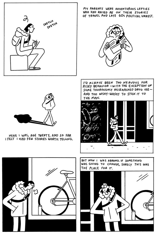
An engrossing and affecting coming of age story, Sophie Yanow’s The Contradictions is a fascinating study of making friends, anarchism and hitchhiking across Europe. If you’ve ever bought an interrail ticket and hopped on a train to “find yourself”, you’ll identify with protagonist Sophie. After choosing to study in Paris from her home in California on a whim, she desperately seeks out like-minded people – namely queer, left-wing feminists.
Based on nothing more than her fixie bike, Sophie introduces herself to Zena, a vegan from Brooklyn and self-proclaimed anarchist. They strike up a friendship based more on convenience and a smattering of shared interests than a strong immediate connection – reminiscent of the short-lived friendships often founded in the early days of University. Seeking the spirit of adventure and following in the roots of her hippy parents, Sophie and Zena decide to hitchhike from Paris to Berlin, via Amsterdam and Ghent.
The problem, Sophie slowly discovers, is that Zena is something of a miser, not to mention full of the hypocrisies shared by many young idealists. She doesn’t enjoy dancing and seems consistently unimpressed with the art and culture that Europe has to offer. She’s seemingly more interested in roaming the streets of Amsterdam in the hope of bumping onto her ex-boyfriend, shoplifting and pontificating about the cruelty of animal products, than embracing the spirit of the trip.
It’s clear that the delicately observed interpersonal relationships are based on her own experiences, and Sophie makes an affable guide. One of the qualities of her work is her ability to capture your attention, despite a relatively low level of drama or conflict, compared with other coming of age stories of the same ilk. The Contradictions is a familiar story of life in your early twenties. Of banking a little too much on a fleeting friendship, of eagerly seeking a connection or a story to tell, and finding the reality isn’t quite what you imagined. Joe Marczynski
Owen D. Pomery – Victory Point
(Avery Hill)
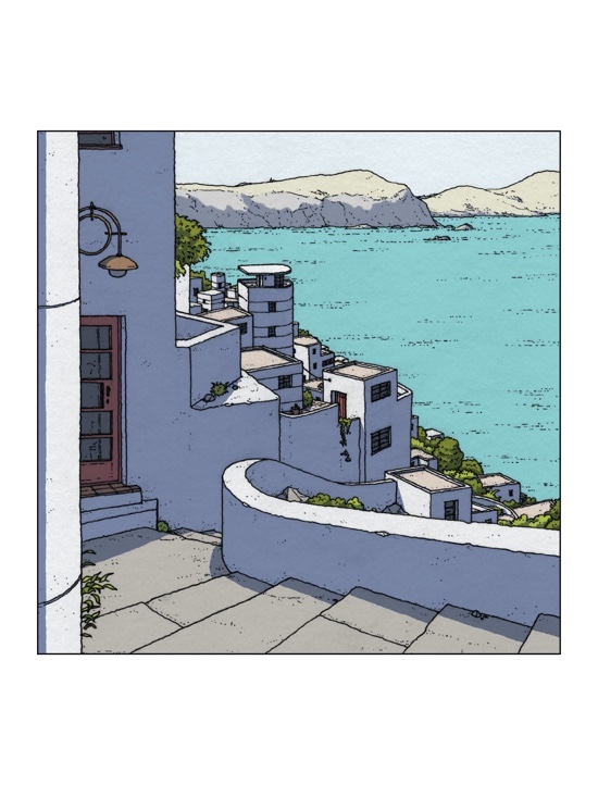
Victory Point is Owen D. Pomery’s second book for Avery Hill, following up 2015’s Between The Billboards & The Authoring Of Architecture. That book outlined the influence that Pomery’s background as an architectural illustrator has had on his comics work, and that training is identifiable in this book. We join Ellen on an overnight trip to the titular home town, a modernist seaside development whose underpinning utopian ideals, like all the utopian ideals of modernism, it seems, have been taken away by the tide.
The first striking thing about Pomery’s art in this instance is his evocation of a warm summer’s day. His soft, digital colouring brings to life the town he has composed. Victory Point the place feels much more than a series of backgrounds; though we only ever see snatches of it, you get the sense that you could step in and meander through its paved streets, enjoying the breeze. Pomery isn’t scared about making us spend some time on incidental details, either, as if seeing through the eyes of the protagonist – this lends the work a “real time” pacing that does a lot to recreate the meditative mindset that Ellen has embarked on this trip with.
Ellen is a much more likable character than Between The Billboards’ central character James Ebner (misanthropy, however tragic, is not often very attractive). In comparison to Billboards, Victory Point also benefits from being a more redemptive work. I still prefer Pomery’s work when it’s more silent, as he has more control over time, body language and mise-en-scène than dialogue for the time being. Still, the “voice of God” interludes that interrupt every few pages, telling the story external to Ellen’s subjectivity, succeed as an interesting narrative trick, and those “quotes” that bookend the work… damn, Pomery sent me on quite a Google adventure with those things. Nicholas Burman
Céline Hudréaux – Maelstrom
(Bries)
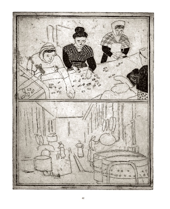
This silent comic is an adaptation of Edgar Allan Poe’s A Descent Into The Maelström. There’s been a few comics of Maelström, mostly in the 1960s and ‘70s, in the vein of an EC Comics adaptation standard, where the visual track ends up being mostly illustrative to the text. Céline Hudréaux’s version eschews the first person perspective of Poe’s short story in favour of a meta narrator who’s as interested in fish as the descent of (a) man. This book feels more impressionistic than narrative, a montage of moments tied together purely by circumstance.
Hudréaux creates a strong impression of a remote Scandinavian fishing village, although the sight of a plastic bag floating in the sea hints that time has collapsed. Each page is an etching, and printed in black and pantone brown, recalling Flemish artist’s Frans Masereel’s “wordless novels” of the early 20th century. Some parts are reminiscent of photographs which lose their detail. The book’s design is inspired by the original 1841 publication, although it’s worth saying that that addition wouldn’t have seemed vintage to its original readership. The “aged” look of this publication befits the fact that, post space travel and submarines, Poe’s story no longer seems like a window into the unknown, and more like the imaginary of a time consigned to being a historical moment.
Its aesthetic is reminiscent of recent films such as Bait and The Lighthouse, whose limited frames and monochrome colour scheme have proved powerful at capturing the emotion of what we think it must be like to experience the end of a world at the end of the Earth. Rather than be about the perils of man’s adventuring, Hudréaux’s Maelstrom, read today, seems much more like a commentary about how the sea has been portrayed as dangerous, an enemy – and in this time of global warming, what is there to be more scared of than the sea? Nicholas Burman
GG – Constantly
(Koyama Press)
In 2018, Annie Koyama announced that her much loved Koyama Press would be closing shop by 2021, and the first half of 2020 already saw the release of its final publications. Among them are GG’s Constantly. GG made a name for herself as an artist who produces sparse and melancholic comics with 2017’s I’m Not Here. Constantly is another (mostly) silent work, rendered in pastel and watercolour shades and painted lines. The art looks so delicate it’s as if it’s barely staying on the page, like some whisper only half heard.
Constantly could be defined as magical realism: its plot revolves around the imposition of the protagonist’s existential fears reaching out from her dreams and into her apartment. It’s told predominately in splash pages, with descending three panel pages employed intermittently to draw our attention to particular aspects of a scene. There are pages displaying lined paper, on which are various records of “I don’t want”, like a series of inverse-Christmas lists. These pages act as the few moments where the reader gets some insight into what we can presume is the protagonist’s internal world.
Koyama has published some of Canada’s most exciting cartoonists, like Michael DeForge, as well as famous names south of its border such as Ben Passmore and Inés Estrada. Its closure is a shame, although Annie Koyama herself has decided to move from publishing to patronage, hoping that this transition puts more power into the hands of artists. Whether independent publishing or “alternative” arts practices will ever be financially rewarding looks increasingly unlikely in an increasingly neoliberal world. Not that the arts should be there to make money, but it would be good if the ability to be creative was developed and distributed more equally which, of course, generally relies on access to cash. Hopefully the artists who have made their name with Koyama, and artists inspired by these books, will continue to flourish. In the meantime, you’d be doing yourself a favour completing your Koyama collection by picking up a copy of this. Nicholas Burman
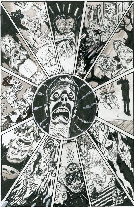
Casanova Frankenstein – Tad Martin #7
(Domino Books)
Casanova Frankenstein – Tears Of The Leatherbound Saints
(Fantagraphics)
These two releases are being reviewed together because they’re issues #7 and #8 of Casanova Frankenstein’s ongoing Tad Martin series. That’s not immediately obvious, and it’s not essential to read these in order (or worry about having access to the rest of the series) – plot continuity doesn’t seem to be on Frankenstein’s mind. He is much loved by his American peers. The Tad Martin series started back in the ’80s, when the artist was known by his name-at-birth, Al Frank. These two books, from 2019 and 2020 respectively, are part of his prolific return since the early 2010s.
While both books portray Frankenstein’s concerns with outsider statuses and horror comic tropes, #7 feels the more subterranean of the two, like a psychoanalytic sketchpad. Tears features more obviously autobiographical stories, concerning Frankenstein’s childhood experiences as a black kid in a mostly white suburb, and his memories being a lifelong punk. Both books feature fantastic cartooning; his lines always seem to be threatening to become too sketchy to understand, but his style manages to sit on the edge of comprehension. The fact that the blue guide lines are still visible seems to point to the theme that these are stories about lives being visited in medias res, unfinished, despite the fact "END" is often written in chunky typeface beneath them.
The main difference between these books is their format. The Fantagraphics published one is smaller and has a glossy cover, while Domino Books’ one is elongated in shape and has a thick, card cover. Tears also features more of Frankenstein’s text, which at times is quite sublime in the way that the descriptive mode can be. The tension that the juxtaposition between his words and images creates is often forceful. The gap between his first works and his current work means that newcomers to comics may miss Frankenstein’s work or relevance; hopefully some of his older stuff becomes more easily purchasable soon. In the meantime, his candid interview on cartoonist Noah Van Sciver’s YouTube channel is well worth a watch to get up to speed. Nicholas Burman
Samuel W. Grant – Life Is A Hologram
(Self-published)
There’s an idea in physics that our universe’s third dimension is only an illusion of depth. According to these theorists, we experience a holographic life, one beamed from a two-dimensional surface. When author Samuel W. Grant alludes to this term in the title of this comic of his, are we to presume that it is in reference to its content as a series of alternative projections of the quotidian? Or, so that we shouldn’t seek to find meaningful depth amongst the seemingly random sequence of events we are presented with here, even if they do allow us to imagine that what we are witnessing is a world unto itself, albeit one trapped by paper?
I refuse to attempt to investigate Life Is A Hologram for any deeper meaning, because it is a lot more fun to take it at face value. Its forty, A6 sized pages present a skittish anti-narrative in which addiction’s role as an outcome of a broken society, failed rock stars, an Afrofuturist Jesus, a grumpy giraffe, and much more besides, are brought together as part of Grant’s kaleidoscopic absurdity. We’re presented with slogans such as “It’s no measure of health to be well adjusted to a sick society” alongside an image of a tattooed woman taking a selfie. Elsewhere, a man playing dress up in a Superman outfit attempts to light a cigarette while complaining that: “Everybody’s a Nazi when it comes to judging avocados.”
There’s a level of surrealism here that Luis Buñuel could well appreciate. Grant’s style (for this book at least, I gather that he’s been self-publishing a lot) is clear and unfussy, though his pen remains gently scratchy and wobbly throughout, which keeps his draughtsmanship lively. These inks are well paired with pastel colours, and the use of different colour palettes helps to inspire a distinct ambience for each segment. Printed on warm, high quality paper, stitch bound, and sold in a clear plastic wallet, this is one of the richest feeling small/micro press books I’ve come across recently, and I can’t wait to stumble across more of Grant’s output. Nicholas Burman
