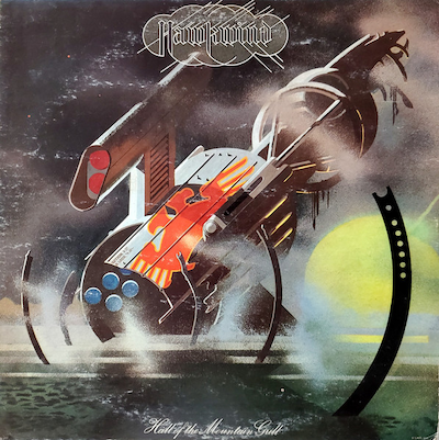
8. HawkwindHall Of The Mountain Grill

This is another Barney Bubbles cover. Quite different from the Edgar Broughton Band cover, but his style is eclectic. There’s a similarity here with the Judas Priest cover. It’s got this flat but metallic look to it – a retro science-fiction aesthetic. The execution of the art is really wonderful: I think it’s all done with airbrush and stencils. It captures the melancholic sound of this album. This rundown, dilapidated, crashed spaceship. The music of this album has a desolate sound – windswept, bleak and dystopian. It has an otherworldly vibe.
The Hawkwind logo here is very angular and strangely designed. Bubbles designed things in ways that aren’t intuitive to me. And that’s what I like about it. Also, the album title positioning at the bottom: that’s not something that I would do. I don’t really know why he did that. It’s a faux pas when it comes to this stuff, because it can easily get trimmed off in the printing process. I like his angles: he does things in a lot of horizontal angles, which I do as well. There’s an art deco element. And then the back cover is a more straightforward sci-fi planet scene with mountains.
I was into science fiction when I was younger, to some degree. I didn’t read a lot of books when I was a kid. But I liked films about science fiction, and I liked the look of a lot of that stuff. I didn’t read a lot of it until I got older actually. I always loved the book covers, because the older 70s and 80s pop science fiction book covers were really imaginative and probably better than the books themselves.


