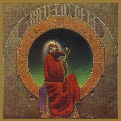
6. The Grateful DeadBlues For Allah

These guys defined the lifestyle. I love this cover. I remember seeing this as a poster in the head shops when I was five years old, or so. I thought, this must be the most heavy, craziest band. So scary, with the skeleton and everything. Then I heard them and they basically sounded like country music. This has influenced me a lot. I’ve used a lot of these same tricks in my artwork. The texture of the stone – the flatness with a bas relief: the carved-out things from the stone, gouges and nicks with their shadows. A lot of this and the way it was executed has made an impact on me.
The Grateful Dead had a lot of good artwork. All their covers were pretty significant and thoughtful. They didn’t have any throwaway things, at least up until a certain point. Their persona and their vibe was very outlier, and the people who follow them are often strange to normal people. All of that played into their mythology over the years.
I thought this cover just really captures them in a really great way. The skeleton is somewhat whimsical. It’s got a smirking look to it. But it’s very masterful, and the colours – it’s really extremely, extremely well done. And I think it captures the music of this album very well. It’s got a darkness to it. There’s something here that’s not bright and sunny and colourful – like some of their other stuff that is more overtly hippie. And this one is a little bit more, not sinister, but just dark. Weird. The music on this one is something that you might listen to in the middle of the night as opposed to in the afternoon.


