4. Edgar Broughton BandOora
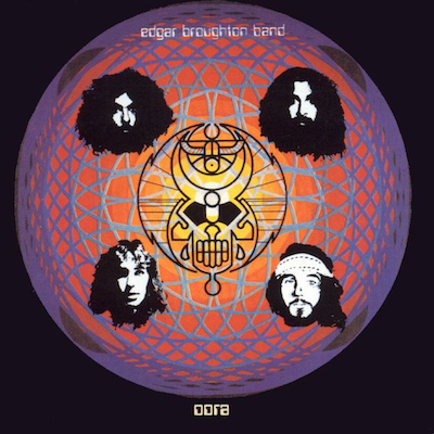
As you can probably see there’s an aesthetic here that I appreciate, with some of the ones we’ve seen so far, that’s got this graphic element to it. There’s bright colours. This one was done by Barney Bubbles, who was a really great designer in the late sixties and through into the eighties. He did a lot of early Hawkwind stuff, and then moved on to punk and new wave bands. He’s got a very eclectic style. It always looks different, but I really like his graphic work, especially that symbol in the centre. It’s very lysergic. To me, it’s got this very psychedelic feel of being strange and offbeat. It’s not flowery like a lot of the American sixties stuff – it’s got more kind of like an edge to it.
And these faces around it as well – one of the things about the original version of this cover was that for the vinyl cover image, the faces were printed on the plastic. So when you took off the plastic sleeve, the faces and the symbol disappeared, and you had this circular mandala-like thing behind it.
It was all done by Bubbles by hand. It looks really abstract, but pleasing at the same time.I thought this was a good example of him making something that’s very strangely psychedelic, almost like acid damage. These people are far gone, the music is far gone, the imagery is far gone. It looks like a product of its time, where there were just no rules. And it’s very hard to imagine the thought process that goes into something like that. I like his style a lot, though. It’s quite different from mine. So I consider him an influence, but I don’t think a lot of people would notice that.