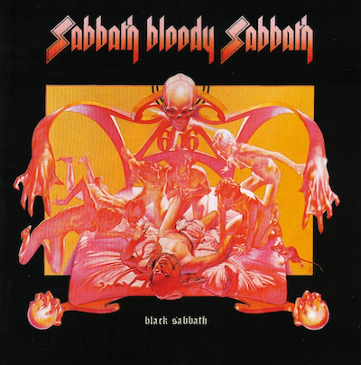
2. Black SabbathSabbath Bloody Sabbath

This is just about as iconic as it gets: for heavy music, for metal music and for hard rock music. Especially as stigmatised as Black Sabbath used to be with their devil imagery and their possible satanic connections, this really, really delivers. First of all, the illustration is superb, and very masterful. It’s done by Drew Struzan. He did Alice Cooper covers and some other stuff you’d recognise, and he went on to become famous for doing all the Star Wars posters, and all the George Lucas and Steven Spielberg films, Raiders Of The Lost Ark, etcetera, all those really great portrait fantasy illustrations. He created a style later, but early on he did various pieces of commercial work.
This one tells you what you want to know about Black Sabbath, which is that they will possess you and possibly take your soul. And on the back cover, the complementary/contrasting image you see is this very peaceful version of the same scene. By contrast, the protagonist is lying in bed, presumably dying peacefully in a totally different colour scheme, surrounded by loved ones. What I like about it is that you can turn it back and forth and decide which one is happening. Which one is a fantasy – which one is happening in his mind?
The band logo is spot on. That became one of their more popular logos. This one is properly severe with those S’s and the angular letters and colours. Obviously it touches a nerve. They look like blades. There’s a harkening to the SS and the darkness of that sort of thing, no doubt. It’s very intentional. It’s hard to say whether it’s fair game to exploit that sort of negativity to create an environment like this. In terms of strictly aesthetics, if it’s possible to remove the association from that stuff, it works quite well: violent, graphic and bold.


