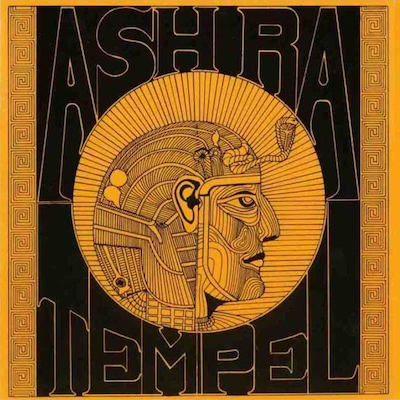
1. Ash Ra TempelAsh Ra Tempel

I have history spending time with this one, staring at the cover and the back, and the interior as well. The illustration is simple and I like the two-colour scheme. There’s something really mysterious and cosmic about it, that captures the way a lot of krautrock sounds to me. They’re so out there and into what they do, and very earnest about it too. I really loved the Egyptian magical aesthetic that this packaging had. It captured the grasping of mysticism that krautrock musicians often attempt, where they reach out to grab magical and fantastic elements from different cultures and work it into their imagery.
The music itself is a nice complement to the artwork, as it should be, and vice versa. It’s very long, mysterious and slowly unfolding. It’s partly the simplicity, it’s partly the Egyptian symbolism and these boldly experimental, improvised heavy sonic journeys that Ash Ra Tempel took. I always like album art that leaves a lot of mystery, and a lot of openness for one to interpret and build the experience themselves. I always like to create an environment for the music to go into and live with my work. To set the stage for the music itself.


