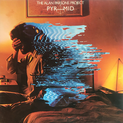
12. Alan Parsons ProjectPyramid

This one is done by Hipgnosis. I tried to not choose one of the obvious ones, like Houses Of The Holy – they have so many good ones. I chose this one because I don’t feel like anybody’s really analysed this one too much compared to covers like Wish You Were Here. This showcases what Hipgnosis was so good at, which was manipulating photos, among other things, and combining illustration and photography together. I don’t own this album, so I can’t really speak to its relation to the music. But I really love the technique of this – it’s like animating on top of a photograph. There’s no motion, no actual animation, but it looks like there’s an action here, or that there’s some world breaking through the photograph,
The parts complement each other really well, especially with the colour differences. You got the cool, watery almost chrome-like illustration over the top of this warm photograph. Everything’s intentional in their work. The character’s pose with the hand, the pyramidal lightship in the background referring to the title — everything has a meaning, which I really like about Hipgnosis’ work.I love the way they design lettering – there’s an actual pyramid here in the title. Everything is meticulous and intentional. They never use straight fonts.
You don’t always know what it is. You might not unless you read about it. Sometimes it’s so subtle, you just won’t ever catch it. But this one is the kind of thing they do where they make something and you’re like, ‘What the hell’s going on here? Let me figure out what’s going on.’ It’s too jarring to pass by. There’s something incongruous about the contrast between the two elements here that makes you want to stop and say, ‘What’s happening?’ A lot of their work is like a puzzle.


