Later on, I would wonder if perhaps it were some elaborately staged work of performance art, so closely would it prove to have chimed with the themes of the show. But at the time, it felt unduly brusque if not actively, deliberately offensive.
“Not my problem.”
The words were spoken by a man with a face like an aggravated sphincter upon my informing him that I could not scan the QR code on the wall to get the list of works for the exhibition I had just walked for an hour and a half to get to because somewhere along said walk my phone had run out of batteries and now refused to turn on. This was my first time in an art gallery in some three months. Up to that point, I had been quite looking forward to it.
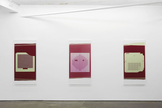
Nick Relph’s current show at Herald Street Gallery consists of eight large C-prints in identical shades of pink, burgundy, and cream, each in their own clear perspex box frames, a little over 150cm by just shy of 80cm, in portrait orientation. Without the meagre context of titles, those few teasingly pompous paragraphs on a press release, or maybe some text on a wall to offer some marginal anchorage, they come across as quite aggressively oblique.
They look basically like massively enlarged depictions of circuitry or computer chips or something (the gallery website would later reveal them to be analogue photographs of “photomasks … an imaging resource used to transfer information onto microchips”). Which is to say, they look like information – albeit, information which is not for you to understand.
There is also a film, its flatscreen likewise portrait-oriented and more-or-less the same size as the prints on the opposite wall. It judders and glitches through three different source images, variously chopped into blocks, inverted, and crashed into.
- A famous photo of Vivienne Westwood and Jordan in full punk regalia standing beside a red London phone booth c.1976. As the image stutters and zooms in close in a series of jagged leaps we are able to catch sight of a notice on the inside of the phone box, possibly containing emergency telephone numbers, but the closer we home in on the sign, the more illegible those numbers become, dissolving into so much blurred and pixellated fuzz.
- Isolated words, phrases, paragraphs from the classic paper by Benoit Mandelbrot, ‘How Long Is the Coast of Britain? Statistical Self-Similarity and Fractional Dimension’, first published in the journal Science on 5 May 1967.
- A small section of a line-drawn map of the coast of Britain, somewhere – I think – in the vicinity of St. Austell in Cornwall (though I wouldn’t swear to it). Again, we zoom in, get closer and closer, but our growing proximity does not reveal more, it only obscures as the thick black line of the coast smudges into oblivion.
The title of the exhibition is How Long Is How Long Is the Coast of Britain, Britain?, so the relation to (3) is a doozy, almost pat. But it’s (2), the paper whose own title is stuttered and elongated into Relph’s that provides the key. “Geographical curves are so involved in their detail that their lengths are often infinite or, rather, undefinable,” wrote Mandelbrot almost a decade before coming up with the fractal geography with which his name would forever be linked.
“Seacoast shapes,” the paper continues,“ are examples of highly involves curves such that each of their portion can – in a statistical sense – be considered a reduced-scale image of the whole. This property will be referred to as ‘statistical self-similarity.’ To speak of a length for such figures is usually meaningless. … geographical curves can be considered as superpositions of features of widely scattered characteristic size; as ever finer features are taken account of, the measured total length, increases,and there is usually no clearcut gap between the realm of geography and details with which geography need not be concerned.”
Mandelbrot’s language of statistical mathematics can be as abstruse as the International Art English found on art gallery press releases, but suffice to say the lack of fine grain introduced when zooming into the Cornish coast is not (just) a problem with the way the map is drawn. Nor is this just a matter for a corner of cartographic science so niche as to be practically redundant.
From financial markets (in which Mandelbrot perceived a “wild randomness” for which modern portfolio theory was completely unprepared) to the transmission and distribution of infectious viruses to the inner workings of many of the mundane tools in your home (notably, the one you are using to read this), we are all of us prey to forces far too complex for any of us to realistically fathom, held hostage by ‘black boxes’ which process vast quantities of information that simply is not meant to be read by you or I.
Which is also most people’s experience of entering a commercial art gallery: the feeling of being confronted by quantities of stuff suggestive of meaningfulness albeit presented in such a manner that it positively screams not for you at them. The closer you look, the louder the work bellows its lordly insistence that you are not the intended recipient of all this lovely meaning here, a performance in which gallery stuff are occasionally only too willing to conspire.
Nick Relph, How Long Is How Long Is the Coast of Britain, Britain? is at Herald Street Gallery on Herald Street in east London


