1978: year zero for Factory, and Britain was still in the dark ages, at least as far as design was concerned. Despite the joy of Psychedelia in the sixties, the post-war fifties had not been swept away, merely swept under the carpet to emerge again in the drab corporatist early seventies.
I like to think that this book shows a new, colourful, exactly drawn dawn in those dark days. I recall a phone call one night a few years ago from one of the central figures in this book, the ‘man in dressing gown’, the legendary Peter Saville. Peter had rung to discuss an exhibition at the Festival Hall in London; I think it was called ‘Destroy’ and was supposed to be an exhibition of Punk artwork, posters, sleeves and drawings delightfully sandwiched in plastic. I had been surprised when the organizers had asked for some of our stuff (‘our’ being Factory) since we were post-Punk and would not flatter ourselves with the four-letter designation. Peter had rung to say he’d just been to the exhibition. Which had closed. So he’d missed it.
No surprise there. But he had heard one of the curators talking on Radio Four, explaining that it was these posters and record sleeves for a bunch of avant-garde bands who emerged in the wake of the Pistols, that had kick-started what became known, laughably, as ‘Designer Britain’. The D.B. tag may be reviled today, yet how unbearable if we still had to live in a country where that revolution had never happened. How much better to dress in black than in grey, metaphorically speaking.
It all began after a very, very bad Patti Smith gig in late ’77 or early ’78 at the Manchester Apollo; as I was leaving I was stopped by a young man (he probably looked like Bryan Ferry on a good day after a bad night – that’s the way he always looks) who said he was a graphic designer and if I ever needed some work doing he was the man. Two weeks later he came to see me and we sat in the Granada canteen. Did he bring some work to show me? Yes. Was it his work? No. It was a book on Jan Tschichold. I was hooked. We pored over covers for Hoffman-LaRoche catalogues and Constructivist posters and Penguin book covers. I am obsessed with people who are cleverer than me. Peter was cleverer than me.

Two months later I’m sitting cross-legged on the floor of a flat in Hale while this kid moves blocks of black and yellow around on the floor. A general contemplating his troop formations. That was Fac 1. I suggested that our first record should be Fac 1, but Peter objected. ‘No, that was the poster, this has to be Fac 2.’ And since it was a double 7-inch single – the first I could remember since Magical Mystery Tour – the appropriateness of the Factory numbering system was born. By chance. Like everything else.

It was a fantastic idea to differentiate our little cottage industry record label (run out of Alan Erasmus and Charles Sturridge’s flat in a Manchester suburb) by having sleeves that were glossier, more expensive and more beautiful than those of the multinationals. Great idea, only we never had it. We just did what we wanted to do. And then post-rationalised it. We clothed our singles in glossy sixties-EP-style packages. And then men like the great and sadly late Scott Piering, Rough Trade plugger extraordinaire, would stand outside Radio One pulling the indie vinyl out of its glossy arty sleeve and inserting it into a white nondescript 7-inch bag, to make it look as if it came from a major label.

Why was packaging important for us? Because the job was a sacred one. Music had transformed our young lives, children of the sixties all. And now we were in the privileged position of putting out records ourselves. Does the Catholic Church pour its wine into mouldy earthenware pots? I think not.

We started with hand made, to get the finish we wanted, from stuffing the silver paper of Fac 2 into plastic bags to paying Joy Division to glue sheets of sandpaper – Naylor’s Abrasives, Bredbury – to the Durutti Column album (Alan shouldn’t have brought in the porn video, as the guitarist, drummer and bassist watched the vid and left their singer to do the gluing – semen-like paste everybloodywhere, like something out of Erasure). By the way, the picture of Fac 14 hides the fact that after the sleeves dried, they hardened into curves and valleys which made the surface even more destructive.
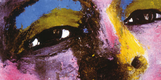
Although Factory’s heritage seems to be one of perfect design and typography, that is no more than half the story. Tim Booth of James came in one day with the artwork for his first single. He presented us with a seven inch square of green felt-tip hurriedly wiped across white paper. ‘OK, you want something like this?’. ‘No. I want this.’ ‘OK.’ Tim thought he was epataying the bourgeoisie. In fact we thought it was a great idea to completely go against the grain and have a piece of undesigned rubbish. It was about time.

While Saville may have designed the definitive acid house sleeve with Fine Time, the second half of the Factory story is best summed up by the painterly eccentricity of Central Station, of Matt, Pat and Karen. That cover of Bummed, the outside a black-and-white photo covered with oil paint, the inside that got ten thousand copies returned by US distributors and upset Genesis P. Orridge (yes, I’ll repeat that, it upset Genesis P. Orridge). It wasn’t the fact the woman was middle aged, it wasn’t the shaved pubes, it was the colour quality which made the viewer feel dirty. Sheer genius, that.
And so it goes for all those who created the images in this book. Thinking about it all brings to mind wonderful memories; wonderful memories of wonderful people with whom I and my partners were privileged to work. Exasperated, but privileged.
FAC 461 – Factory Records: The Complete Graphic Album is published by Volume

