As Autumn arrives so do another pair of comic festivals, with The Lakes International Comic Art Festival on this weekend, soon to be followed by Thought Bubble in Leeds from 1st to 6th November. With plenty of more mainstream creators, plus the usual small press crew, both look like excellent events well worth travelling to.
And so, on to the comics.
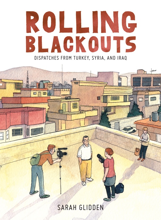
Sarah Glidden – Rolling Blackouts
(Drawn & Quarterly)
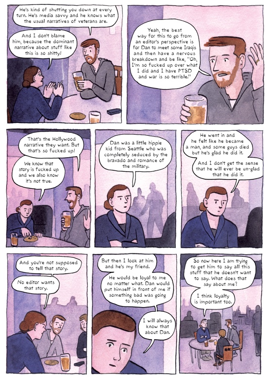
Sarah Glidden’s new book Rolling Blackouts is currently enjoying plenty of media coverage. This is not surprising – it’s a big book on a serious subject with a multi-layered narrative. Glidden used Kickstarter to raise funds for a two-month trip to Turkey, Iraq and Syria in 2010, and the book is written from the recordings she made there accompanying two journalist friends as they attempted to find stories about refugees in the Middle East. Also in the party was Dan, a veteran of the Iraq war who had fought in the American invasion. The book is about the plight of refugees, but also the role and function of journalism, a subject Glidden reflects on as she observes her friends.
The four travelling companions make for an interesting group dynamic. The two journalists observe, trying to find stories they can sell, which will pay for the trip and allow them to produce less commercial pieces of their own, clearly where their hearts lie. The cartoonist observes the observers, not exactly detached but trying very hard not to influence events, frequently musing on how she feels the trip is going for her friends. The ex-soldier (a childhood friend of one of the journalists) steadfastly refuses to have the sort of experiences that would make a good story, and this causes tension within the group. He’s very keen to let Iraqi Kurds know he fought there, but initially much less keen to share this with Arabs, and there’s a strong sense of a search for transformation that does not come easily.
The art is painted in Glidden’s soft, gentle and non-threatening watercolours, a very good match for the subject-focused, non-confrontational style of the book. This is a far from as polemic as it could be, doubly distanced from the places they visit and the people they meet by the cartoonist observing the journalist format. Near the end there’s a mention of the ’show, don’t tell’ mantra of journalists, and it’s one Glidden herself applies.
The fact that Syria has collapsed so heartbreakingly in the years it has taken Glidden to draw and paint these 300-odd pages adds an extra layer of poignancy to a book already filled with tragedy observed and recounted. The country functions as a kind of sanctuary for refugees in the story, an irony the reader cannot fail to note. In the final section she wonders if the change makes her book less valuable. In many ways the opposite is true – she provides a snapshot of a time that has passed. This is a thoughtful book that leaves us to make our own minds up rather than presenting a simplistic viewpoint, fully deserving the attention bestowed upon it. Pete Redrup
Charles Burns – Last Look
(Jonathan Cape)

Last Look collects the three volumes of Charles Burns’ most recent work in a single trade paperback. Although the hardbacks of X’ed Out, The Hive and Sugar Skull are still available, this is a much more affordable proposition, and it’s a pleasure to return to the world he created and read the whole saga without a two year wait between parts. There’s a strong Herge influence running throughout this, from the appearance of the mask on the cover, through the use of colour in contrast to the striking monochrome artwork of Black Hole and other earlier work, and to the original release pattern of volumes emulating the French and Belgian tradition of albums. Indeed, more than a few times we see a comic titled Nitnit being read, just in case we’d not noticed what Burns is doing.
This is a complex, multi-layered narrative with a classic unreliable protagonist. Straight away Burns drops his character and audience into a world of grotesque creatures, with rotted faces and appalling foodstuffs. After a while he wakes up and it seems to be a dream. Doug (or Johnny as he is in the dream world) is clearly recovering from some physical injury to his head, and also appears to have some psychological injuries too. Part of the treatment for this looks like heavy doses of opiates, and he’s finding it hard to cope; when the doorbell rings he drops a Pop Tart, and one or both of these events causes him to break down in tears. His dreams or hallucinations reference many images or events from his past, and the multiple timelines (the present, various pasts and the dream world) converge on the theme of guilt the more we understand.
Burns’ art is sensational. The images from Johnny’s story are genuinely disturbing on every level. As always, his characters tap into various archetypes of American youth and family life, but with a sinister edge showing darkness behind the American dream. Burns’ work is seductive, disquieting and original and if you don’t already have the separate volumes, this is a great chance to read the story for the first time without it taking four years. Pete Redrup
Antoine Cossé – Palace No. 0
(Breakdown Press)

Palace No. 0 by Antoine Cossé is part of the recent batch of books Breakdown Press released in time for Safari festival. Despite being a collection of hard-to-find strips published elsewhere, this is a strongly cohesive work. Life here is lived by the water, with beautiful sun drenched views out to sea, dazzling architecture and tropical flora if you turn inland. It looks like a fantastic place to live, and yet life here is not fantastic, for the people or the animals that inhabit many of the stories.
Cossé is a particularly inventive artist, with bold layouts that draw the eye across the page. Traditional panels give way to single or double page compositions with multiple focal points, a technique used to great effect in The Garden, a long story about a man narrated by a duck. This veers from the mundane through mystery to horror and is the standout here for me. The following piece, Volcan, features a pair of page-width panels that bleed over onto the next page, with parallel narratives in long lines spread over several pages converging at the very end. Frequently composed the way we might expect an arthouse film to be shot, we find ourselves gazing at the buildings and landscapes with detachment as events unfold.
There are many questions left unanswered. Cossé gives us a world in which people coexist with anthropomorphic ducks, and others wear animal masks to sinister effect. There is often a threat of violence, sometimes latent, sometimes realised, and philosophical musings coexist with dialogue. This book served as my introduction to Cossé’s work (apart from a couple of anthologised pieces I’d previously seen), and did an excellent job. It’s a genuinely superb release from Breakdown. Pete Redrup
Tim Bird – Grey Area: Our Town
(Avery Hill)
Our Town is the fourth in Tim Bird’s ongoing Grey Area series, and the follow up to The City To The Sea, winner of Best Comic at the 2015 British Comic Awards. This comes as an A4 saddle stitched booklet on high quality paper stock, a format that really pays off here – it looks and feels fantastic.
This quietly melancholic volume, containing four short chapters, is very much about the past. Two sections are memories, and the other two look back to those times. There’s very limited narration, and even less dialogue. Quite a few pages consist of wordless panels. The sparse narration, which often features half formed questions without answers, shows common territory with the work of Simon Moreton, although the art could not be more different. It also has an atmosphere reminiscent of Seth’s Nothing Lasts, yet the work is distinctively Tim Bird, in no way derivative. There are, perhaps, common personality traits expressed by certain types of cartoonist that we can see here.
The palette used is heavily grey, as the series name and past issues suggest, with striking use of red. There’s a feeling of less precision and less detail to the drawing than the previous volume, perhaps a reflection of the concern with the past and the inherent unreliability of memories. For example, the same location (a thrice-mentioned retail park) is coloured quite differently in two chapters, simple greys when remembering childhood contrasting with detailed colour and shading when revisited as an adult in the present. This is a comic of few words that resonates quietly afterwards, a quick read that leaves you going back for more, and the work of a confident, maturing cartoonist trusting his storytelling instincts. Pete Redrup
Various – Dirty Rotten Comics #8
(Throwaway Press)
The Autumn 2016 issue of the small press anthology series Dirty Rotten Comics is upon us, featuring short pieces by a range of artists. One of the things I like about this series is that the roster changes, and I’m only familiar with a couple of those included this time.
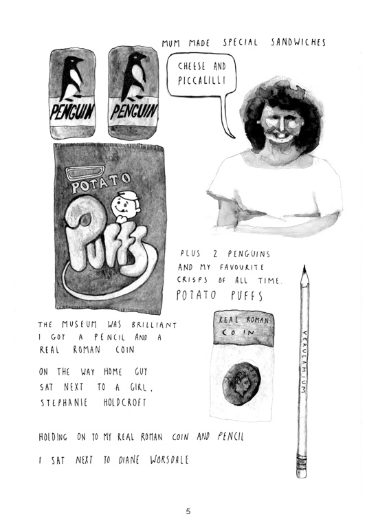
An early highlight, Henry Miller’s Real Roman Coins is an agreeable snapshot of a school trip, and a return visit as an adult to the same place, small child in tow. The deadpan narration and nostalgic reminiscences evoke both past and present through a selection of images of objects.
Knots, Benjamin Leon’s comic is another strong piece, very visually inventive in both the art and the layout. As the character leaves home to work, he becomes more tied up in the titular knots. This heads into territory that wouldn’t look out of place in a Decadence publication, except with a thicker line than Lando or Stathis Tsemberlidis use, until he returns to the safety of his own home. I was also really impressed with Rozi Hathaway’s Sørgedag, a tale of grief and loss that utilises many of her trademarks whilst still looking different to her other work as a result of the textured paint she used. Striking and sombre in black and white, watch out for a colour version in the future.
There are plenty of other excellent pieces in this volume. Although I thought the hit rate was slightly higher last issue, this is very reasonably priced at £4, and would still be good value with half the pages. It’s a great chance to see some interesting short pieces and to discover new artists, and is well worth a look. Pete Redrup
Tiphaine Rivière – Notes On A Thesis
(Jonathan Cape)

Nobody can accuse Tiphaine Rivière of ignorance about her subject. Notes On A Thesis is about a PhD student who also works in administration at her university. Before writing this book, which started life as a blog, Rivière spent three years doing exactly that herself. The fact that she finished in such a timely fashion shows that she is a much more diligent student than Jeanne, her central character, but there’s no doubt that this book contains much truth about both education and self-motivation.
Jeanne is a schoolteacher who quits the moment she hears she’s been offered a PhD, despite the fact that her funding application is rejected. Excited at how she imagines this is going to play out, the moment she realises she has no boss, you can see the weight of this freedom drawing down on her. What follows is a tale of procrastination, played for laughs both visually and narratively. Paris – both exterior and interior – is drawn beautifully with particularly sympathetic architecture, while the people have an exaggerated style to portray their individual characteristics.
The book demonstrates an amusing honesty about the world of education from both sides. A frequent theme is the lies we tell ourselves, and those we tell others to fob them off. Jeanne rarely says what she’s actually thinking, and is as dishonest to herself as those she encounters. We can all relate to the difficulty of motivating ourselves to do tedious work – this is not just the preserve of PhD students. This is a light, often farcical book that nonetheless rings true in its depiction of human nature. Pete Redrup
Rick Remender, Jerome Opeña and Matt Hollingsworth – Seven To Eternity
(Image)
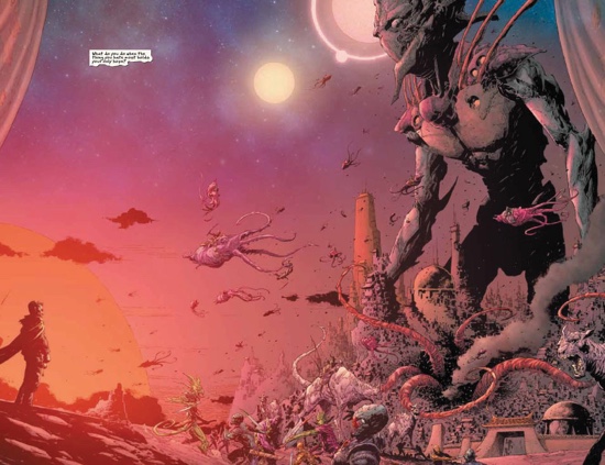
“Seven To Eternity takes readers on a hard road through the strange fantasy world of Zhal. All men have surrendered their freedom for fear. Now, one last free man must choose."
The preview issue of Image Comics’ gorgeous new fantasy epic from veteran creative team Remender and Opeña and with the extremely impressive colouring skills of Matt Hollingsworth does elegantly what an epic preview should, tells you all you need to know and not a bit more, and almost all you need to know is encompassed by that introductory contradiction. The script is full of enough absolute statements, weather phenomena characters have never seen before, hardest things and statements about all and every man, to leave the reader in no doubt that these are indeed the worst of times. As a woman I can’t quite help taking exception to the "all men" line either, but that’s another issue. And I hope the strong female characters introduced as members of the protagonist’s family he must leave behind, never to see again actually do feature in further issues, and not just as a daydreamed motivation. Katie appearing on the cover is a good sign.
The world building here is consummate, with generally a good ratio of recognisable tropes with intriguing details, the use of the word "nails" in the preface originally made me judge that it could have done with a proof read, but further occurrence clarified that these are some significant magical weapon, whose nature will no doubt be revealed in time. The imagery is spectacular, with plenty of multi-coloured beasts and races oozing spectral fluorescence, wielding mysterious powers and riding flying squid into battle. Only the protagonist, Adam Osidis, and his brood are flesh coloured (and incidentally in this universe the ginger gene seems to be dominant, unless "Ma" later turns out to be step-Ma).
But as their human looking rural idyl is shattered in the opening pages, Adam must venture into the vivid and surreal warscape that is the dominion of the "Mud King"; "God of Whispers". This character of seemingly insurmountable power that is mentioned on nearly every page is the truly intriguing part of the story, and what Adam must do to face him will be the business of the ongoing series. No doubt each adventure will be never before seen by its characters, and will provide visual poetry of the fantastical variety the likes of which its readers had never dreamed. Jenny Robins
Ben Katchor – Cheap Novelties: The Pleasures of Urban Decay
(Drawn & Quarterly)
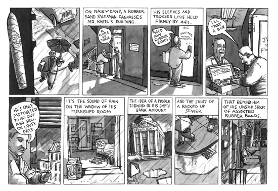
Cheap Novelties: The Pleasures of Urban Decay by Ben Katchor is a collection of strips originally published from 1988 to 1991. No single narrative is revealed from reading the strips in one sitting, but a feeling of melancholy, nostalgia, and loss pervades throughout the book. The main character is Julius Knipl, a real-estate photographer, who catalogues a deteriorating city while taking notice of the modernization of the world around him.
Although the book takes place in NYC, it is easy to make connections to any city or town. One strip that reminded me of a detail I’ve seen in many places before was of workers pouring new concrete over a section of damaged sidewalk. The new concrete glares brightly against the darker more weathered slabs, and it isn’t until years later that the patch begins to blend with its surroundings. Unfortunately, the new concrete can never completely match because the new mixture does not include the same minerals that make the old sidewalks sparkle. This leaves a lifeless void in the midst of twinkling magic, illustrating a failure of the modern world to blend in no matter how hard it might try to conform.
Not much needs to be said of a book that was previously published before, but the production deserves to be noted. Comics are a perfect marriage of words and art, and that should be reflected in the object. A comic should be a piece of book-art, and that art should begin with the cover and endpapers. In this example of book-art the cover looks like it was wrapped in tanned newspaper, and inside are advertisements for gimmicky home goods such as, a tube of mud, “Hundreds of hilarious uses are apparent even to the smallest child,” or the silent handkerchief that includes a powerful nose suppressor, or a figurine that commemorates the death of fallen window washers. The faded look and artificial world the ads suggest begin to tell the story before page one is even reached. When we finally do journey through the rest of the comic, we discover a world disappearing into oblivion. Fortunately, Katchor’s strips do not share that fate, and return in this beautifully produced reprint. Matthew Laiosa
Lucas Varela – The Longest Day Of The Future
(Fantagraphics)
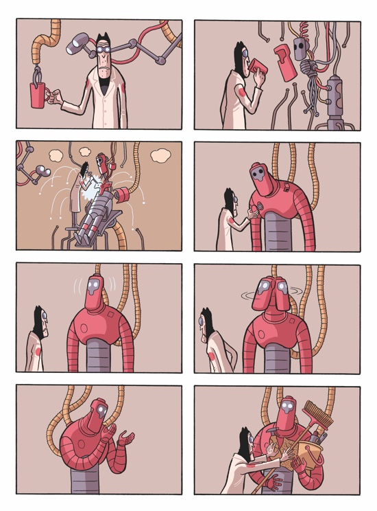
If a picture is worth a thousand words, then the approximately eight hundred separate wordless images of The Longest Day Of The Future by Lucas Varela exceeds the word counts of some of the wordiest books of all time including, War and Peace, Infinite Jest, and Atlas Shrugged. Technically this argument could be used for most comic books exceeding one hundred pages, but what separates this book from others is the clarity of storytelling.
Like an episode of Futurama directed by Charlie Chaplin this slapstick story full of sci-fi adventure follows two dueling corporations and their attempts to sabotage one another. The pawns recruited for this nefarious task consist of an alien equipped with a multi-dimensional suitcase, a malfunctioning killer-robot that prefers chasing insects, and a man that daydreams of a non-existent paradise. Not only do these characters reluctantly fight for their corporate overlords, but they also face a world so oppressively saturated with technology that it becomes funny. Television screens, robotic arms, and feeding tubes are ever-present in the tops of panels, following the characters wherever they go. It is a wonder that the intruding gizmos do not end up in a tangled mess in their competing efforts for attention, begging the age-old question: does technology control us, or do we control technology?
You would expect a sci-fi world full of ray guns and flying saucers difficult to introduce without words since many science fiction films require drawn out opening narration or lengthy prologues, but Varela is able to drop you in his world immediately without any confusion. He accomplishes this by designing his pages with a fixed eight-panel grid giving the reader something to expect on every page. Following a rigid pattern, using a limited color palette, and copying the exaggerated body language of silent-film stars provides few distractions, so that when Varela does decide to experiment, such as in a page that reads in reverse when a guard fires an alien laser that ping-pongs around the page backwards, we never lose the simple trajectory of the narrative. This book reinforces that less is more, and that words should be used in addition to images versus images being used in addition to words. Matthew Laiosa
