
Dave McKean’s dreamlike and unsettling imagery has illustrated graphic novels and non-fiction, and underpinned the visual concepts of films and television series. His collaborators over the years include Neil Gaiman, Grant Morrison, Richard Dawkins and John Cale.
One often overlooked element of McKean’s acclaimed work is the record cover design he has undertaken across a range of artists, from Bill Bruford to Buckethead. In particular, his distinctive and genre-defying style visualised a shift in alternative rock in the mid-90s, where many bands were pushing their music beyond established boundaries. The albums produced by industrial and metal outfits in this period − Skinny Puppy, Front Line Assembly, Testament, Fear Factory, Machine Head, Paradise Lost − were fearless and exploratory, with McKean’s design ‘a lens through which you enter the work’.
How and when did you get into album cover design?
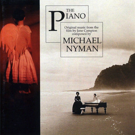
Dave McKean: I think the two jobs I dreamed of doing as a teenager were comic book artist and record cover illustrator. Maybe film director was in the mix as well, but that seemed to be an impossible mountain to climb. One of the very first jobs I did while I was in my third year at art school was an image for a record cover for Isao Tomita. A local design company had the job for some reason, and the head of design was an external assessor for my art school. When I left college I had already met Neil Gaiman, and started working towards being a professional illustrator. When Arkham Asylum [a graphic novel written by Grant Morrison, illustrated by McKean] came out in 1989, it was such a big print run that copies ended up on various art directors’ desks; it was a very useful portfolio for me. I started doing metal and goth covers due to the dark images in Arkham, and a couple of comic fans in record company editorial positions also gave me work. Some bands as well were asking their labels to contact me. I had a few bad experiences with early book covers, so started designing my own work as damage limitation really. I didn’t really enjoy the design element until I bought my first Mac in 1993. I learned how to use it, Photoshop and Freehand on a CD cover package for Michael Nyman − the soundtrack to the film The Piano.
What was your process? Would you listen to a band, or follow a brief?
DM: I’d always try to get some music from the CD to listen to, even just rough mixes. The titles and lyrics were important, but it was much more interesting and inspiring to just listen to the atmosphere and the emotion in the music and respond to it. Most of my solutions are figurative, so they were mostly channeling the emotional content through a figure or face or sense of place. Very few covers have been briefed. The odd one has come with a starting point, or initial idea. A few have come with preferences, certain images or colours, or overall tone. Sometimes they come with a short list of things they don’t want. But mostly I’ve been able to find my own solutions. I do a few very rough doodles, just to get the basic idea across. Roughs usually take all the energy out the final image, so I try and keep it open-ended so I can play while making the final thing.
When did your relationship with Roadrunner records begin?
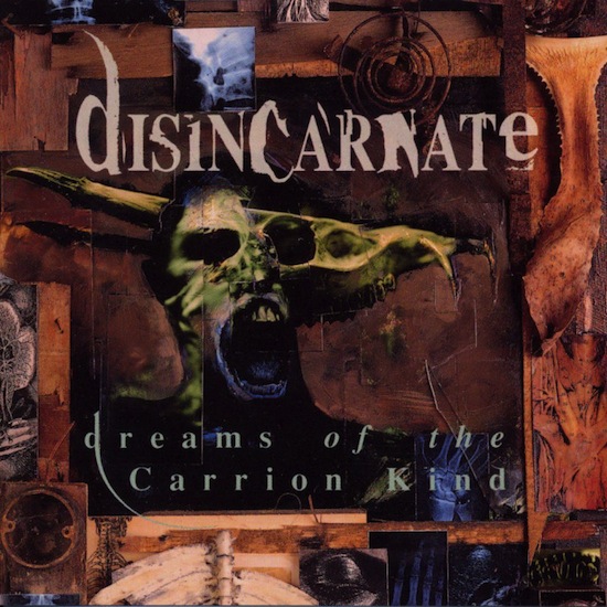
DM: I think the first cover I did for Roadrunner was for the band Disincarnate [Dreams Of The Carrion Kind]. It was a large collage piece, and was pre-computer. I had to get it photographed on 10×8 transparency, and I was still ordering my typesetting from a bureau. A painfully fiddly process, I hated it. But I was happy with the cover at the time. I reprinted it in Dust Covers (collected Sandman comic covers), because I think James Murphy [Disincarnate guitarist and death metal legend] was a Sandman fan. James was very open-minded I think, and certainly didn’t bring any metal baggage with him.
Did you consciously seek to move away from classic heavy metal motifs and iconography?
DM: Yes, they seemed stuck in a rut, very obvious, very unimaginative, and rather dated. Almost any genre in any field ends up repeating itself, because it is trying to repeat past successes. I was more interested in darker, stranger, more disquieting images, and more psychological angst than physical. I think I ended up attracting bands who were interested in evolving the music a bit as well. More storytelling and strangeness in the lyrics, musical explorations into electronica and noise.
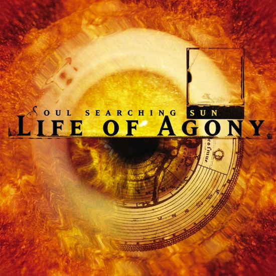
Speaking of ‘psychological angst’, one of my favourite covers of yours is Soul Searching Sun by Life Of Agony − it’s a raw, vulnerable album that also took their sound a leap forward. Was the title of the album evocative and strange enough on its own to draw inspiration from?
DM: Yes, I’m not sure I even got to listen to much of this. It came out of the lyrics and the title, which is quite a poetic, non-literal image. Life Of Agony is a pretty depressing name for a band, so I didn’t want to just make a miserable, tortured soul image. The title seemed to suggest a positive energy in opposition to the name of the band. Hopefully there’s a bit of that reflected in the cover.
Are there any covers you were particularly happy about?
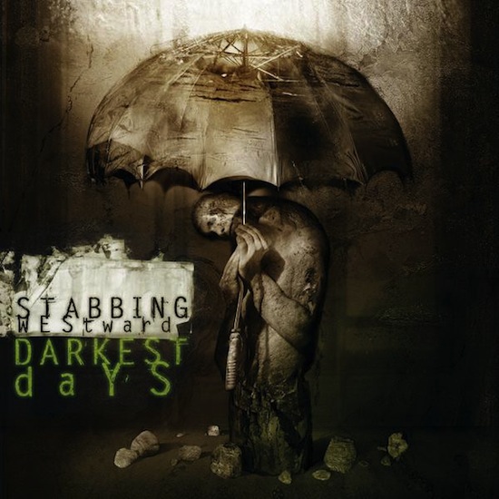
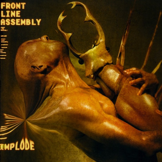
DM: There are some over the years that I still have in my presentation when asked to speak at conferences and festivals. I like the Front Line Assembly covers, I think they’ve got better through the years, and I like the band. I liked doing the Skinny Puppy covers and the Stabbing Westward cover. The Fear Factory covers came out well, but only after a lot of rather pointless back and forth. The best and most enjoyable run of covers I’ve done were for Bill Bruford’s band Earthworks. There have been several others over the years that I still like, they were generally good fun to do. I’d spend a day with the music and, no matter what I thought of it, I could find a mood or an image that I’d never otherwise have created. I enjoyed designing CD covers once I had a Mac. I missed vinyl really. A few covers at the beginning were released on vinyl, and ironically, a couple of recent ones have as well, but during the period of time I doing a lot of covers, they mostly only came out on CD.
How did the emergence of CD digipacks and gatefold sleeves in the mid-90s impact the way you worked?
DM: Much better. I never liked jewel cases, does anyone? They are so tatty, and easy to break and scratch, they are dreadful. But digipacks and gatefolds, and even CD-size wallets, like a mini vinyl album, I like. You can develop a theme and tell a story, you can play with the type and they feel solid and fully formed when they come out. They are still small obviously, which necessitates a certain kind of image and typography, but as I say, I never really got into 12 inch design, I was too late.
Are you a cover artist defined by the CD era?
DM: For music? Yes, I guess so. I’ve done a few covers that were created particularly for 12 inch gatefold covers, John Cale’s Circus Live in particular, and there’s nothing like that scale of the image, it really was a golden era of package design. And now CDs are becoming a thing of the past. There is a resurgence in vinyl because they have an intrinsic beauty that CDs don’t. I don’t get asked to do CD covers much any more, there are no budgets, and there are just fewer being made. But there are other avenues opening up that only exist because of the digital revolution.
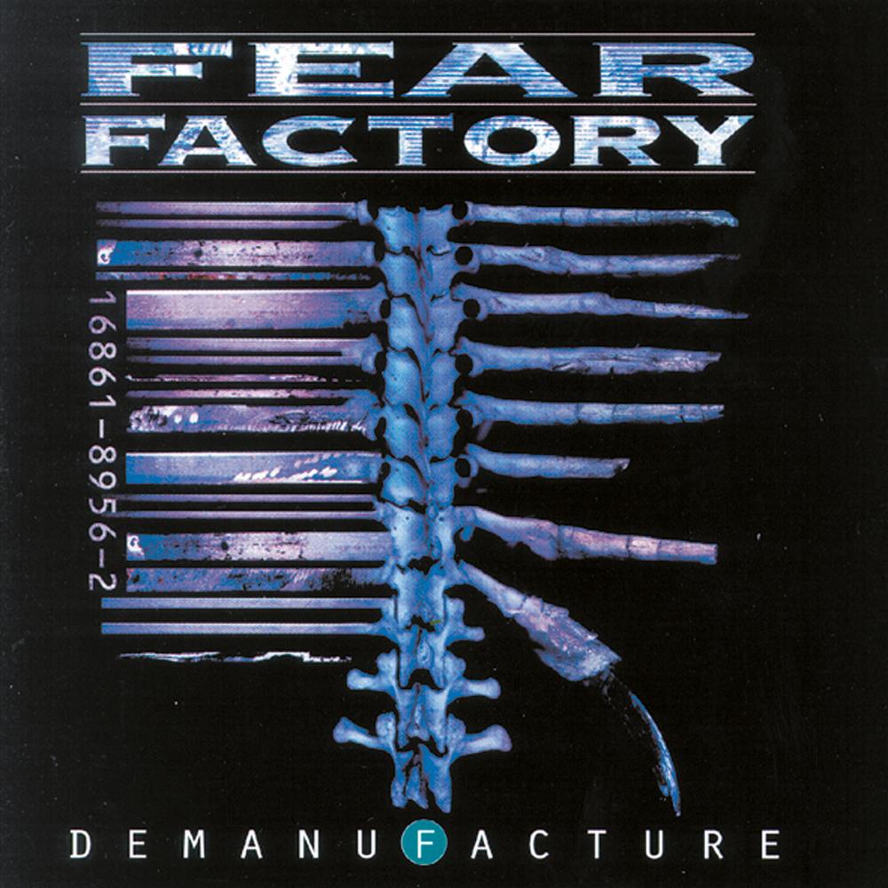
Fear Factory’s Demanufacture is a really iconic cover. As a concept album about man versus machine, did that make the barcode/skeleton approach clear to you from the outset? Is its strength in its simplicity?
DM: Yes, I think we wanted to find a strong idea captured in a simple image, almost a logo or brand. The use of the barcode seemed appropriate to speak about the homogenisation of mass culture, reducing everything to this strange series of lines and a number. It’s also the blight of most designers’ work, especially on something as small as a CD, it’s such a bland imposition on a design, and there are rules and regulations about how it can and can’t be used. It’s mass production stamping all over individual creativity. The spine and rib cage element seemed to specify the human machine, and the cage around the heart. I used a heart image for one of the single covers to come off this album. It was one of those sketches that immediately seemed right and I’m glad it was relatively easy to implement and finish. After that, working with Fear Factory became much more difficult.
A band who really broke the mould at the time was Machine Head. Burn My Eyes is a revolutionary, tough, incendiary album − was that a challenge to represent? Where did you take your cues?
DM: That was one of the first covers I did with photoshop, and I remember it being a real struggle. It doesn’t really have much of an idea to it, it’s just a feeling. I didn’t want it to be too realistic, nor too abstract. But because I wasn’t used to using photoshop at all, it kept becoming too smooth and airbrushy, or too dependent on the photographic sources − I just couldn’t get something I wanted. Before that I would do a rough and then paint or photograph the final image. With this one, I just listened to the music and tried to get something to work in photoshop, almost in an improvisatory way. Honestly, in the end, I don’t like it very much these days. It’s almost a catalogue of all the stuff I see in novice photoshop users that I’ve learned to avoid now. I was going to do their second album, and I had, I thought, a much better image in the works, but they had problems with it, and we parted ways.
You’ve mentioned Skinny Puppy and Front Line Assembly: does industrial music which experiments with electronica and noise, lend itself most readily to your artistic style?
DM: I’m happy responding to almost any music so long as there is some passion, emotion, imagination to it. I have very broad taste. A lot of the work I’ve done for industrial bands is, again, trying to get away from the genre clichés, or finding new uses for them. FLA in particular have been very supportive of my experiments with their image. I’m not always sure the record labels are happy with this, but Bill [Leeb] has a wider vision than simply reiterating the stuff he’s done before. Rhys Fulber was also a really strong voice. He’s an excellent producer in his own right.
Do you think strong cover art actually transforms the experience of listening to music? As listeners, do we understand or interpret albums more vividly when we have visual reference points?
DM: Well, I do. The idea of a piece of music having a context within the whole shape of an album, within the art and design that is the shop window for that album, within the overarching career of an artist, within the social and artistic context of the era − a lot of that has gone in favour of individual context-free digital tunes. Despite the huge availability of internet media, I can only see the losses, not the gains. Like a book or comic cover, the art and design is a lens through which you enter the work. At its best it creates an almost Pavlovian response. As soon as you see a certain kind of artwork, or font, or design, your brain snaps back to the times you’ve experienced this work before, it creates an ongoing relationship in your mind with this work. It’s very powerful. I think it creates a deeper, long term and evolving connection with art. In our fragmented interweb times, I don’t see my children’s generation relating to art, and music in particular, in this self-defining way so much. I hope I’m wrong about this.
Is it ironic to you as someone who employs digital technology in your working methods that the takeover of digital distribution for music has rendered covers (quite literally) a vanishing art?
DM: Once you open Pandora’s Box…
I think we are only at the beginning of understanding quite what this almost evolutionary jump, from an analog culture to a digital one, has in store for us. It’s very hard to imagine the repercussions, because it’s a massively chaotic system.
I still draw and paint almost everything to start with. The finishing may be done to a greater or lesser degree using digital tools, but I still find a more interesting and involving final image in a real world that includes texture, entropy and mistakes. But digital tools have allowed me to get much closer to the images in my head than I could before. They’ve allowed me the chance to make films and music in ways, and for budgets and therefore with the degree of control, that I couldn’t before.
Digital distribution has changed the landscape completely, and there’s no putting the genie back in the bottle, so we are forced to change. If we believe real physical objects have a magic that downloads don’t, well, we just have to create beautiful, compelling things that prove the point.
Is there a collection of album designs for one artist (or across artists) that you consider individual parts of a bigger piece of concept art?
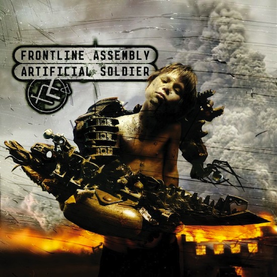
DM: Not really, although with each CD package I try and create a glimpse of a world. Sometimes it is a version of our world, an alternate futuristic, or nihilistic, or dream version. For example I think the part-human/part-android soldier on FLA’s Artificial Soldier CD lives in the same environment as the other releases before and after it.
The world I created for Bill Bruford over several releases involved references to urban jazz, but also a playful, fantastical world of sculptural characters and imaginary instruments, living small animated lives within an imagined city. Earthworks’ music touched on cultures from around the world, and recreated jazz in a European, channel hopping, restless, humorous, surreal way. I was also trying to keep Bill’s fans from his days with King Crimson and Yes, while reaching out to a new jazz audience. My covers for Iain Ballamy have continued in this vein, as Iain was in Earthworks’ first incarnation. My recent cover for Roy Harper fits into a world of imagery I’m exploring at the moment – the animal nature inside us.

What is the significance of the human face, particularly the contorted or agonised expression, in your album artwork?
DM: The human face is the most deeply ingrained image in our brains. It is the two dots and a dash we connect with as babies. It is the focus of our attention in our relationships with each other. The face and the human figure express all we are. Everything else – architecture, art, even landscape – we usually understand in relation to us. Most of the music I’ve illustrated has a lyrical content, so it is immediately in the realm of ideas, not just emotions. I guess I see all these things through human eyes, reflected in the expression of human faces.
How do you consider all the album artwork you’ve done in the spectrum of your other work?
DM: I think as design jobs they are generally more fully realised than the book covers, or even the comic covers I did. I think even the limited storytelling, or development of a theme, available in an eight page CD booklet and case, appealed to my narrative tendencies. But they are not very personal. I couldn’t say they express anything really personal to me, they capture a mood that was provoked by the music. I think if I only worked on my own projects I would go a bit mad, and if I only worked on other people’s projects I would get very frustrated. So a balance of the two is good, record covers provided a very enjoyable balance to my own projects.
Do you have favourite record cover artists?
DM: There are many illustrators I like who have done record covers, from Matt Mahurin (Tom Waits, Kronos Quartet, Metallica) to HR Giger (ELP, Debbie Harry). But the ones I like best are the complete artists who do everything, design the whole package. My favourite is Steve Byram, a wonderful illustrator and great designer, who always surprises me with his work.
