All images: John Minton / copyright The Estate of John Minton / Royal College of Art, London
A spirit of romanticism prevailed across many areas of the arts in the years following World War II, particularly in painting and illustration. For the book arts, the decade from 1945 saw a flowering of romantic book illustration, a flowering that appears in hindsight to have been a mini ‘Golden Age’ and formed part of a wider movement that would come to be termed ‘neo-romanticism’. The coming together of artists and publishers who shared a vision of what a book could be has left a legacy of publications that are increasingly appreciated as among the finest examples of the twentieth century illustrated book. This post-war yearning for a spiritual reconnection with landscape led artists of John Minton’s generation to emulate Paul Nash and Graham Sutherland in looking back to the visionary landscapes of Samuel Palmer and William Blake as sources of inspiration. Not only did this spirit permeate book publishing but also the worlds of advertising and design, as artists who were as comfortable in print as they were on the gallery wall chose to engage freely with the commercial and applied arts.
John Minton was at the heart of this short-lived movement, which by the late 1950s had faded away, when interest shifted to abstraction. Like many of his neo-romantic contemporaries, Minton was both a painter and an illustrator, although, unlike Keith Vaughan, John Craxton and Michael Ayrton, for example, his paintings are only now beginning to receive formal recognition. His commissions, on the other hand, spanned book illustration, dust-jacket design, illustrations for magazines and journals (trade, popular and literary), advertising, commercial posters for film, travel and the GPO, wallpapers, theatre design, and mural painting. The number of illustrations runs into the hundreds, including line drawings, full-colour gouache paintings for offset lithographic reproduction and, most notably, colour separations for letterpress line-block printing, a process that he exploited with particular skill and invention. Despite the uneven quality of some of the very late work, at its best it approached the sublime. During his short working life he put so much of himself into that aspect of his practice that he set new standards in the graphic and commercial arts.
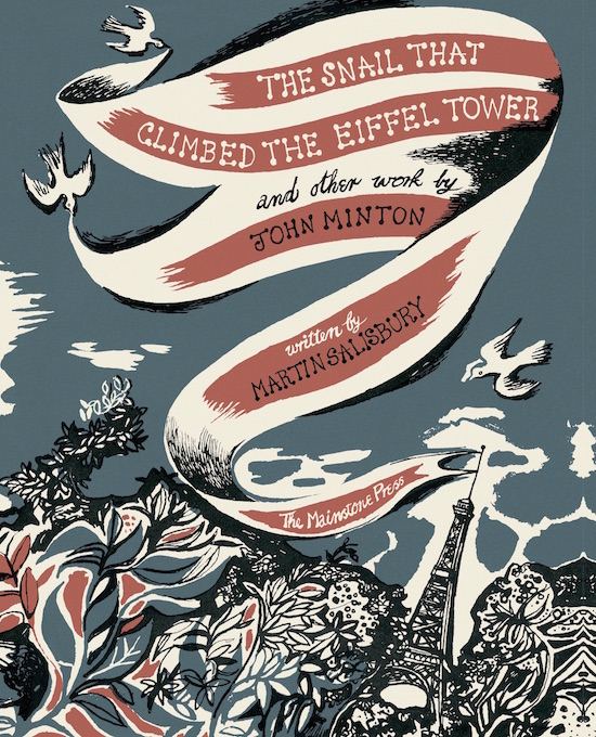
While interest in mid-twentieth century art and design has grown considerably in recent years, John Minton’s prolific output as an illustrator, during a working life of little more than a decade, has been sadly overlooked. One hundred years after the artist’s birth, The Snail That Climbed The Eiffel Tower and Other Work by John Minton gathers together for the first time his commercial graphic work, some of which is little known or previously unseen, to celebrate a major contribution to the distinguished history of British illustration.
All images: John Minton / copyright The Estate of John Minton / Royal College of Art, London
In His Own Words
From time to time we catch a brief glimpse into Minton’s own approach to illustration. He writes about his art in a slightly cryptic but always illuminating way. There is a tantalisingly minimal and self-effacing offering in the publication Illustration & Reproduction by the wood engraver John R. Biggs. Minton was one of a number of illustrators of the day who were invited to contribute under the heading ‘Artists’ views on their approach to illustration’. Most of the artists focused on technique (though Edward Bawden supplies a characteristically taciturn and dismissive ‘I cannot believe that pens used, or paper and ink make any great difference.’) Minton wrote:
Illustration does not exist, as painting does, in its own right: it always relates to something else, namely a literary idea. An illustration should tell a story, should make apparent in visual terms something which has already been expressed in words: this demands a graphic, that is a descriptive attitude towards drawing, except in relation to ‘decoration’ which is not really illustration in its true sense.
All images: John Minton / copyright The Estate of John Minton / Royal College of Art, London
Disappointingly, Minton does not elaborate on this last observation. As a master of this important and perhaps undervalued area of illustration, his
views on the English decorative tradition would have been of great interest. He went on:
In the actual execution of an illustration these practical issues arise:
Its method of reproduction;
Its relation to the printed page;
Its close identification in manner and feeling with the literary idea.
In his succinct list, Minton summarises the depth of knowledge that he brought to his illustration work and his understanding of the importance of equal empathy for the practical, aesthetic and literary.
All images: John Minton / copyright The Estate of John Minton / Royal College of Art, London
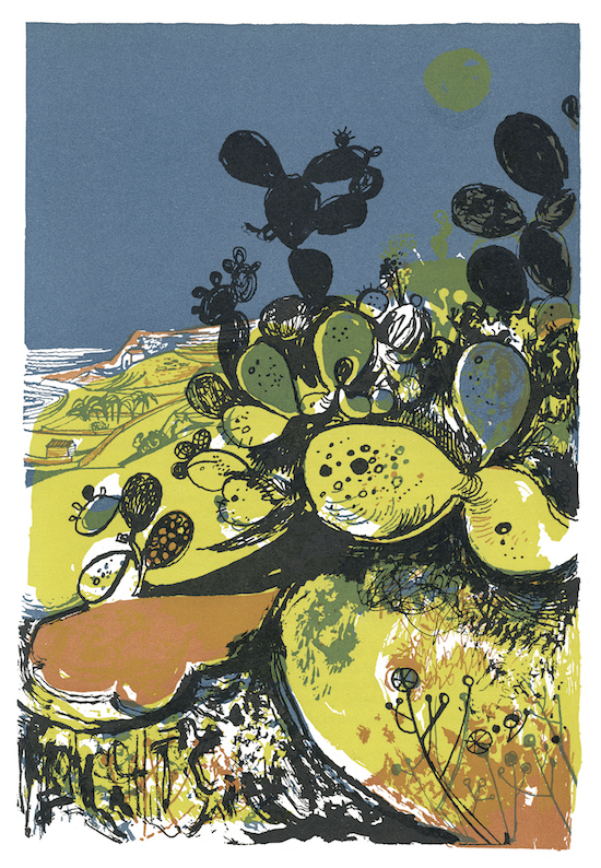
In another manual of practical reprographics, John Lewis’ A Handbook of Type and Illustration, Minton described his working process for creating ‘coloured line drawing’. ‘Line’ is here used to indicate that there is no halftone, only solid shape and line. This was the letterpress line block technique, which Minton was particularly skilled at exploiting, and which required a deep understanding of the print process through which his artwork would be reproduced. ‘Reproduced’ is actually a misnomer, as there was no single, complete original image, only a set of separate drawings, one for each colour, which at this stage would be made in black, making this more akin to the process of printmaking, but in very large editions. Each of these separations would be photographed and etched onto a zinc plate which would be mounted on a press and printed in turn in its selected colour. These separations would be carefully registered and overlaid in places to make further colours. As with autolithography, another process that was popular at the time for projects such as Noel Carrington’s Puffin Picture series, this letterpress process, if originated by the artist rather than through photographic filters, required the artist to be able to visualise mentally the outcome because, once printed, it was too late to make alterations.
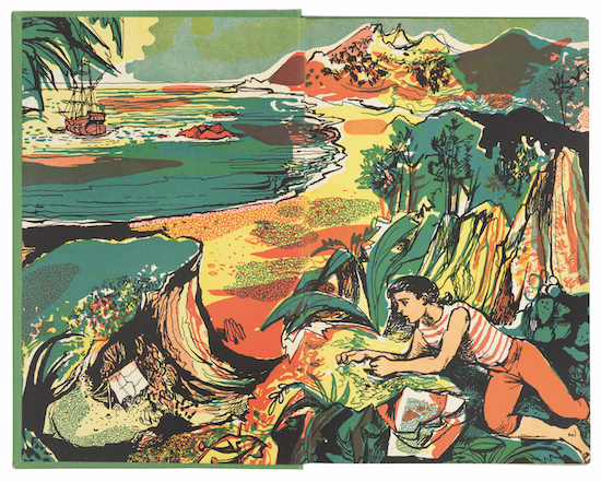
Alongside the text describing the process is a four-colour Minton illustration of a Moroccan scene created specifically for the book as an example of the letterpress line block process. This was the process by which Minton had created his series of colour plates for Time Was Away, arguably his finest work. Many of his dust-jacket designs were also executed in this manner, with often only two or three colours available. Minton’s ability to extract maximum texture and impact within these limitations contributed to his popularity with publishers. Occasionally, he would experiment with the newly available mechanical tints such as Zipatone, most notably on his spectacular endpapers for Treasure Island.
‘The Snail That Climbed The Eiffel Tower And Other Work By John Minton’ by Martin Salisbury is available now from The Mainstone Press

